PORTFOLIO
An overview of my projects
bachelor end project
1. The Base
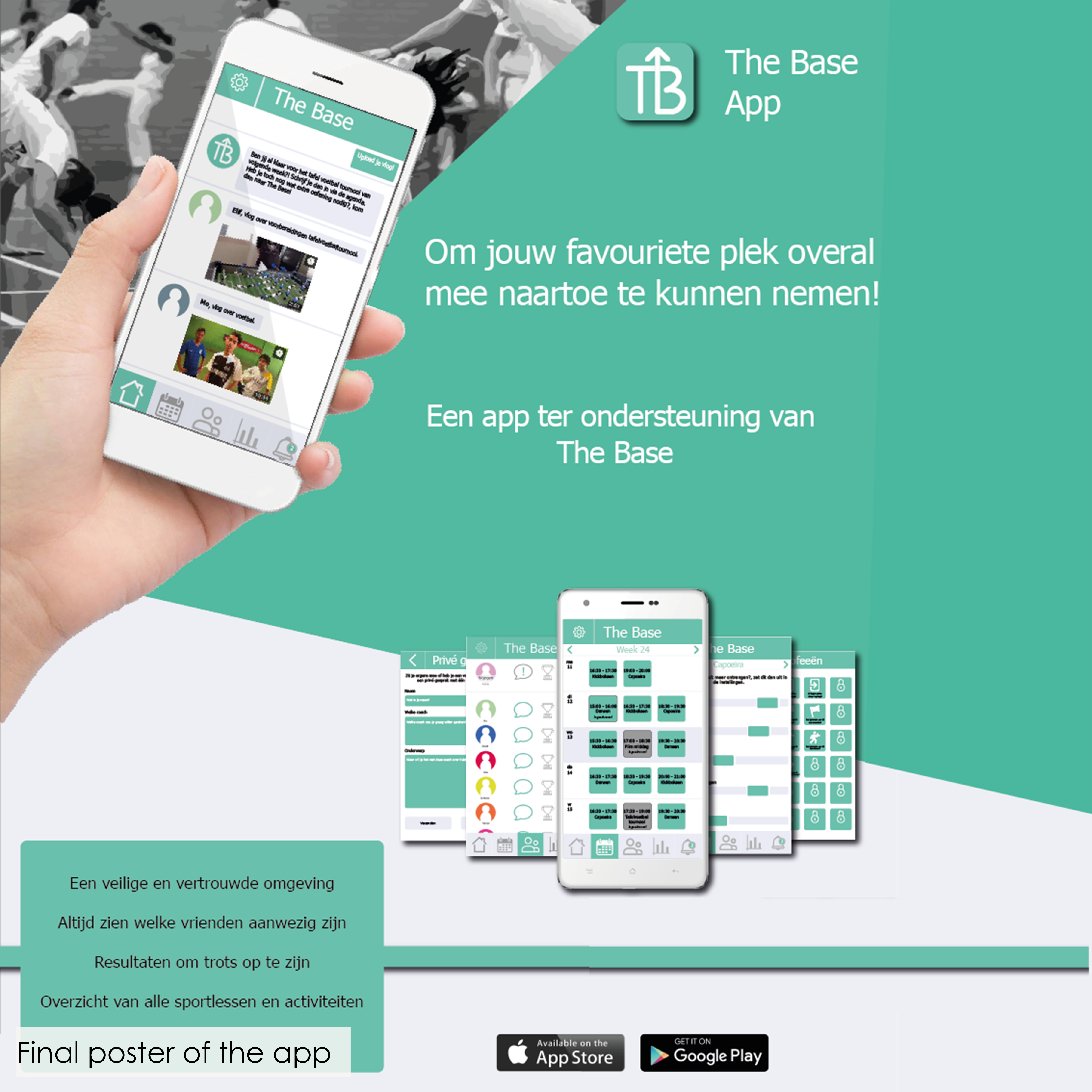
Motivating children from low SES families in Delfshaven to sport at least 2 hours per week by designing an environment where they love to go and which is affordable for their parents.
Client: Enver & Garage2020
Collaboration: Group of 2
My role: Research, ideation, app design
Keywords: Interviewing, co-creation, prototyping using Axure
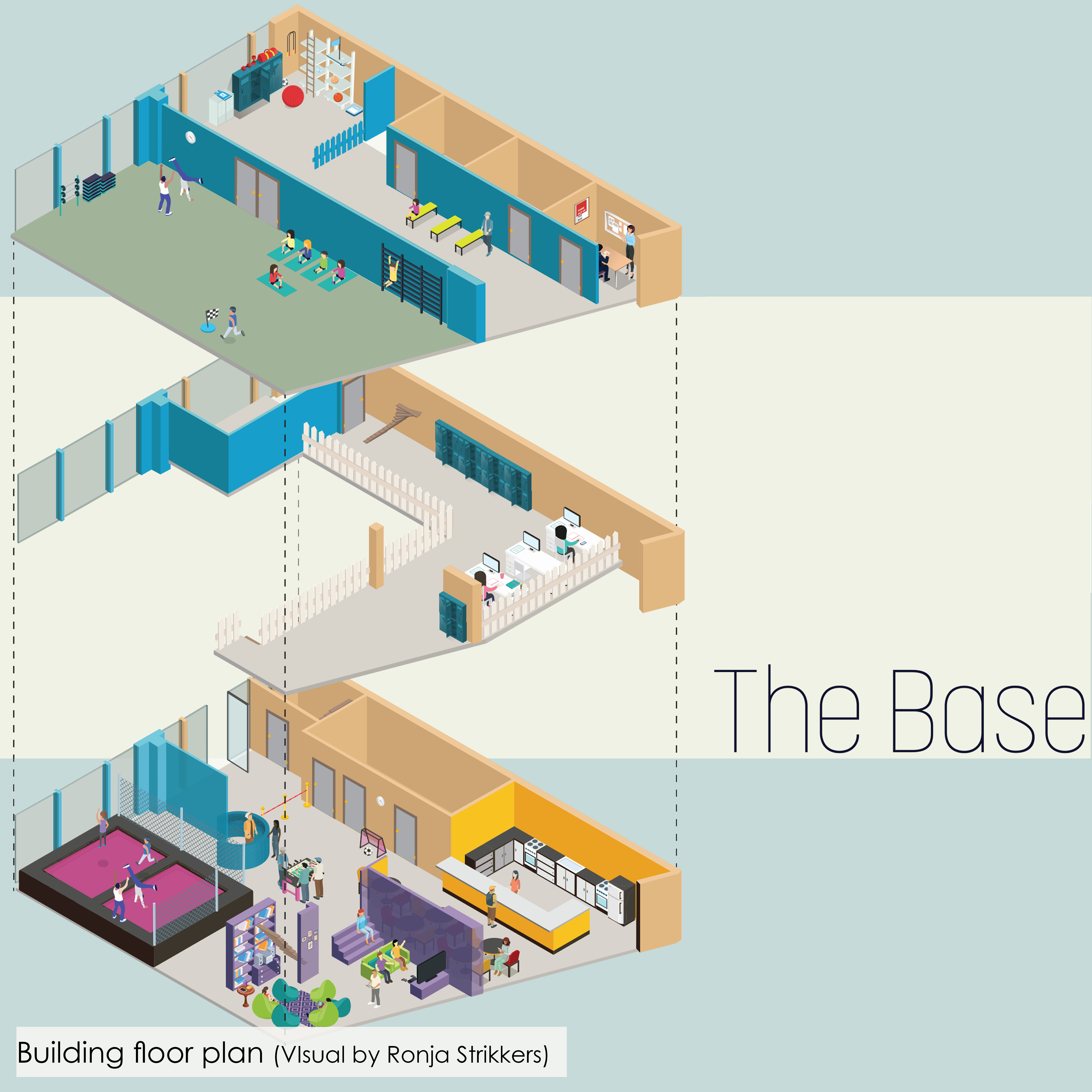
A place they love to go
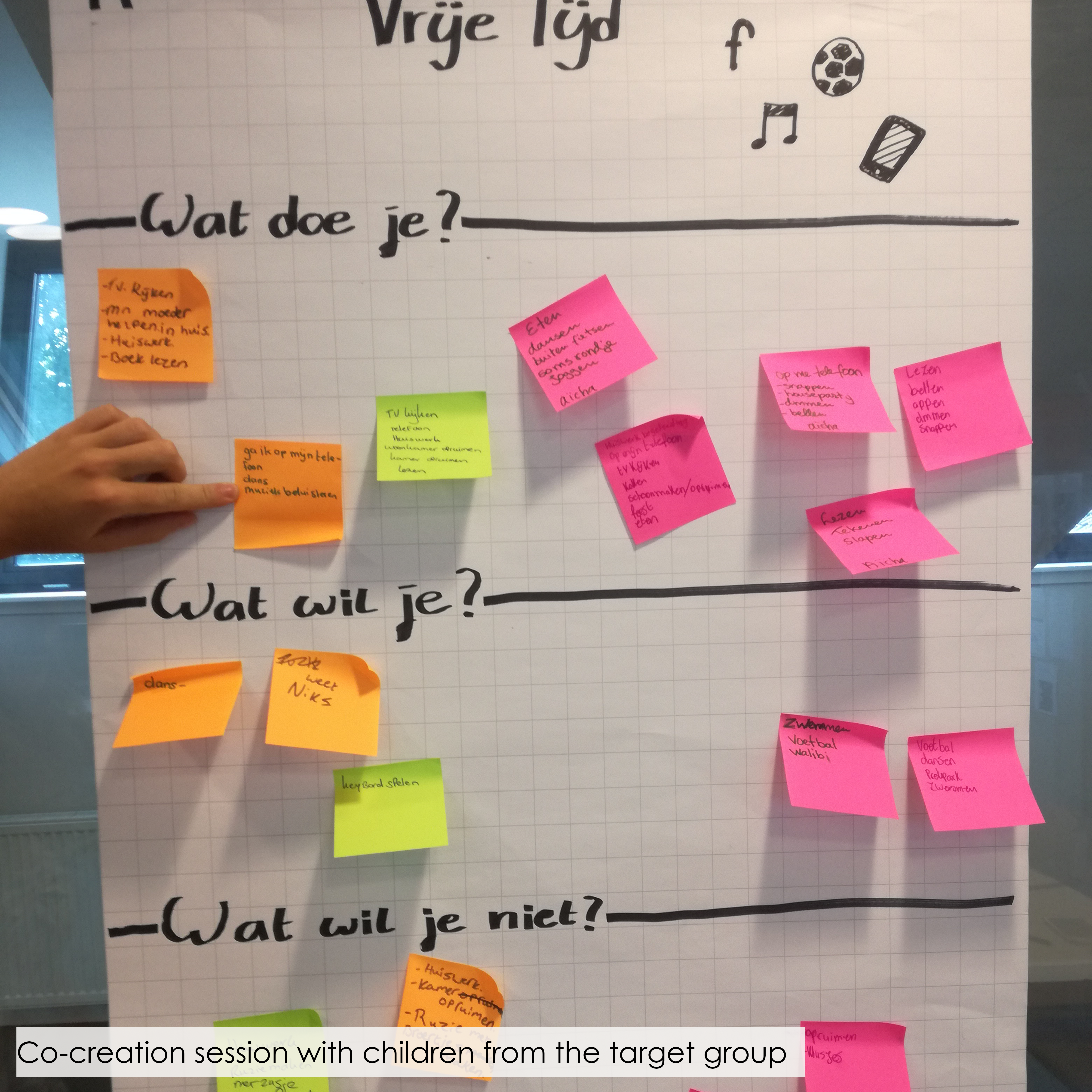
Interviews with different groups of children learned us that a big reason for them to not go sporting was that they preferred to just hang out with their friends.
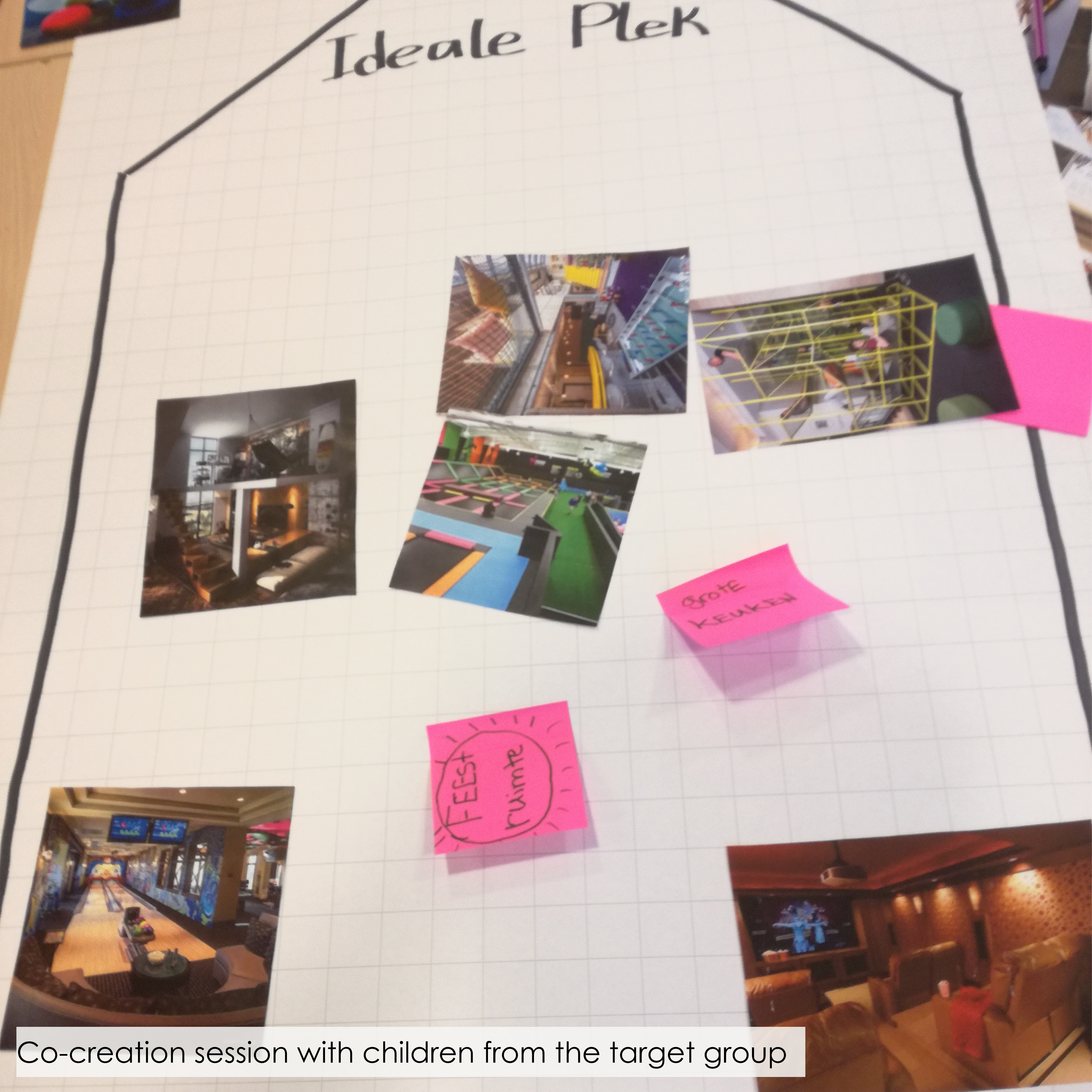
Having their own club house where they can hang out with friends, study and sport was something they were very excited about. The condition of having to sport for at least 2 hours per week on location in order to visit the club house was something that all children were willing to do.
Affordable
Interviews with parents learned us that a big reason why their children could not go sporting was since they simply couldn’t afford this. After talking with our client and several sport organizations we found out that the Jeugdsportfonds gave a lot of opportunities for our target group, but that the parents were unaware of this possibility. In collaboration with the different sport organizations we could make arrangements to make the subscription costs of The Base fall within the Jeugdsportfonds.
Freedom
Interviews with the children showed us that freedom was a very important aspect for them. The freedom to choose on which days they would go sporting, but also the freedom to try out new sports. The base collaborates with different sporting facilities, providing the the children with a variety of sports. Within the app they can see an overview of the different sports and they can subscribe themselves for a lesson.
Personal
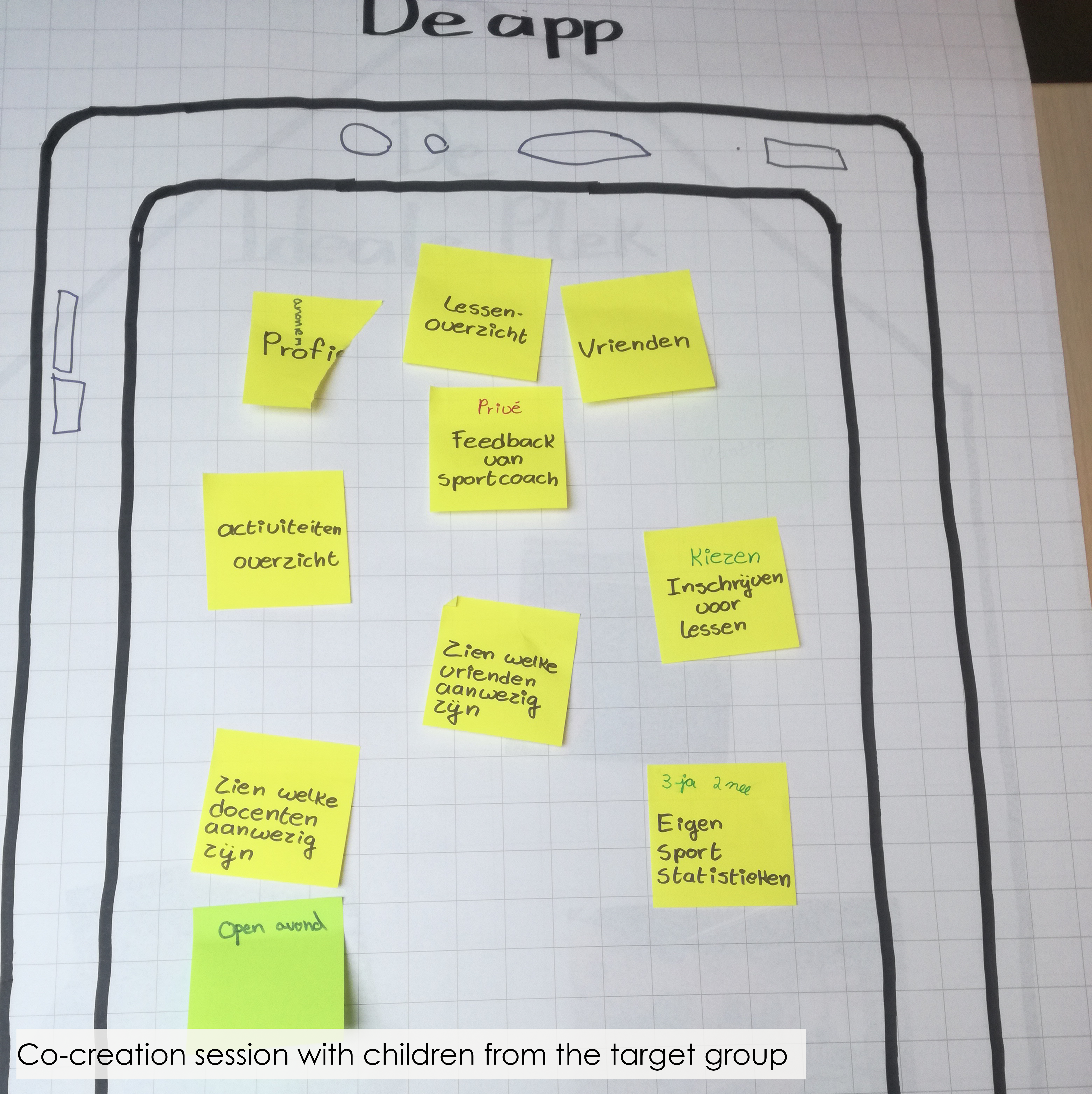
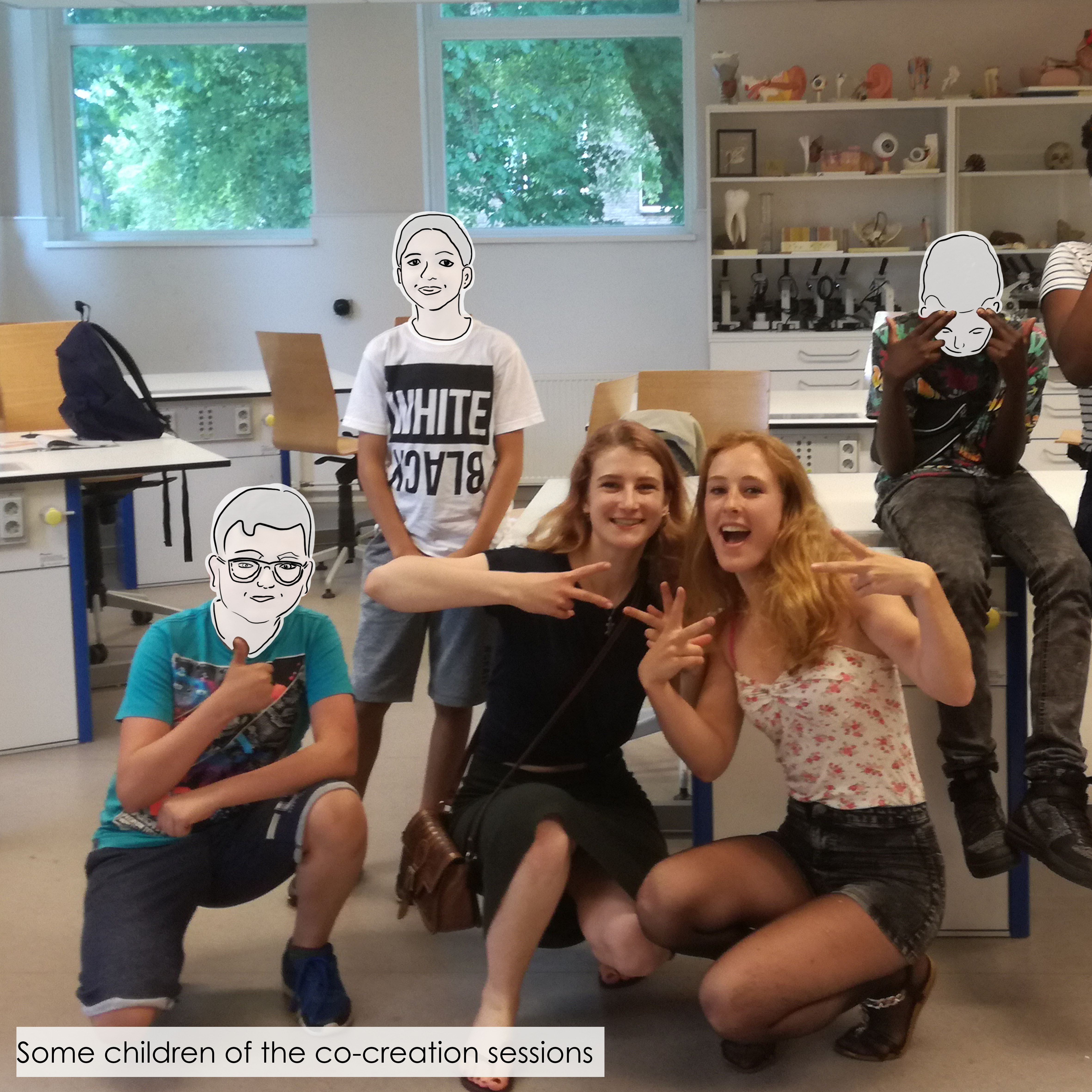
Being together with friends was a very important aspect for the children. In co-creation with the children we came to app functions like seeing which friends are present in the base and for which lessons your friends are subscribed in order to join them.
The thing about this project I liked the most was that we gained lots of rich insights from different stakeholders and were able to combine all insights into one final concept.
For me, this was the project that made me choose the Master Design for Interaction since I really discovered my passion for doing user research.
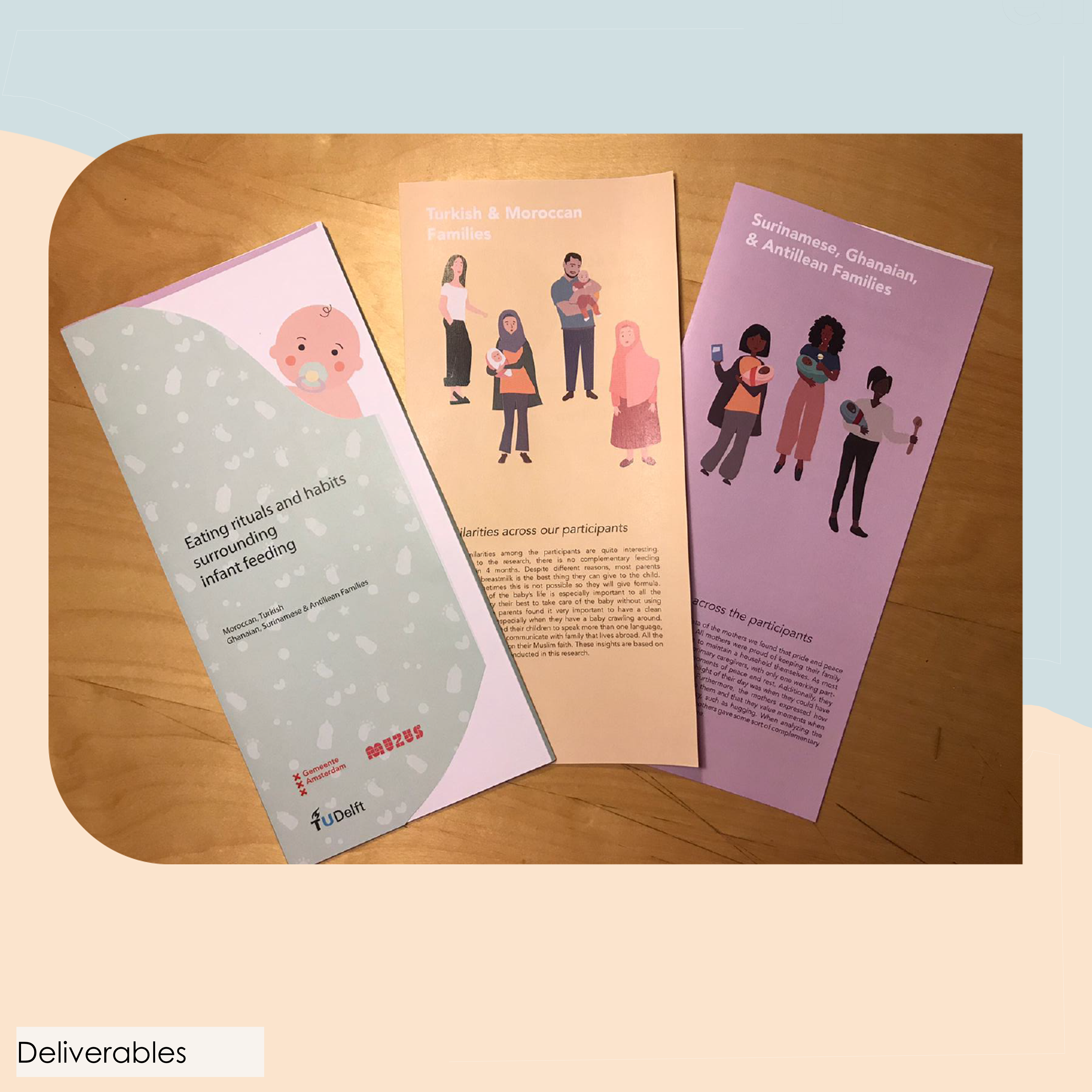
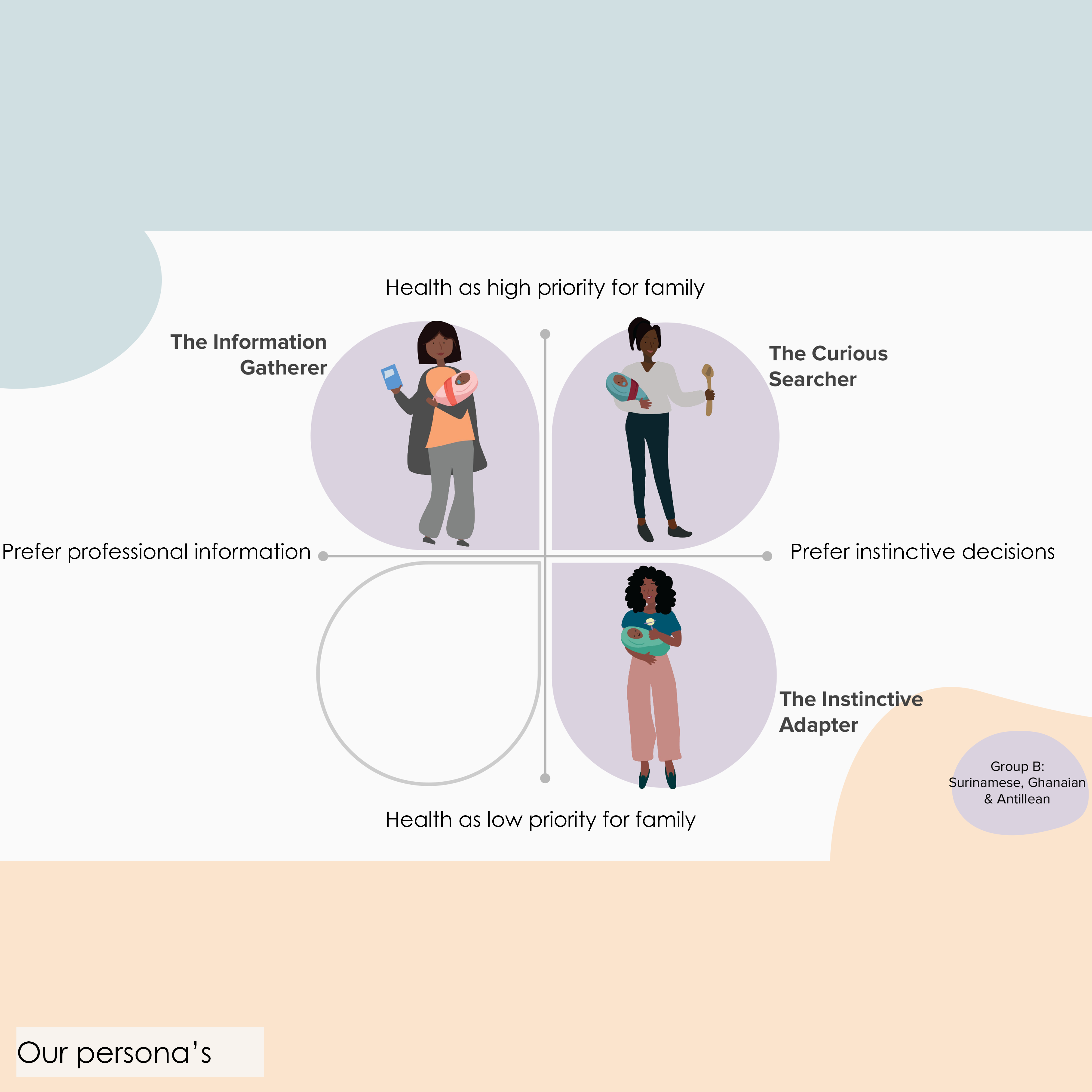
Defining the feeding habits regarding 0-4 months old babies within Surinam, Ghanian and Antillean families in Amsterdam. And visualizing these insights by means of persona’s which provide the GGD with a clear base for further design.
Client: Muzus, GGD & Municipality of Amsterdam
Collaboration: Group of 4
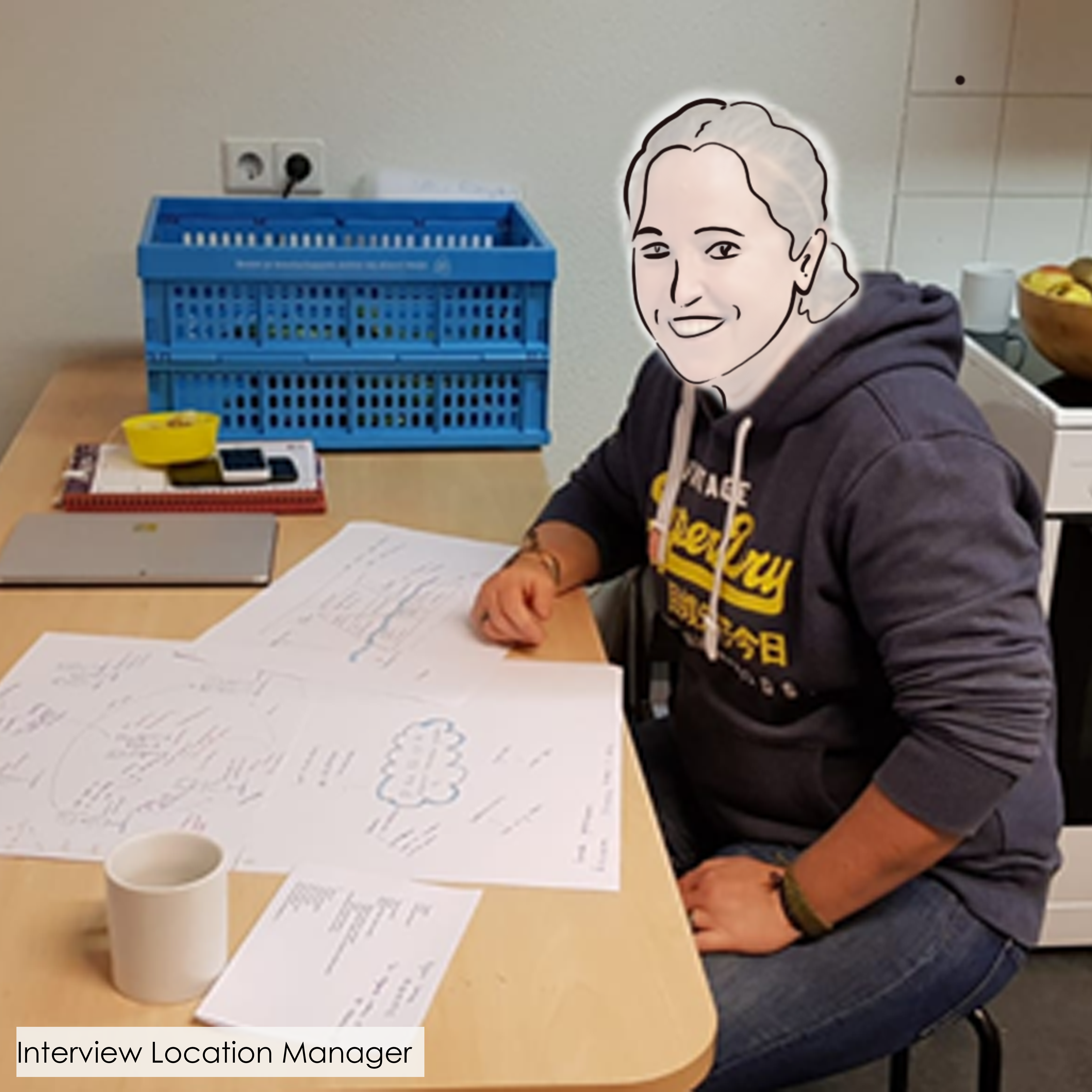
My role: Interviews, analysis
Keywords: Interviewing, Contextmapping, analysis, persona’s, creative facilitation
Different approaches
During our research we found that there are three main types of parents when looking at the baby feeding rituals. If the municipality really wants to have a positive impact on the different feeding habits they should have multiple approaches since the different groups have such a difference in values and needs.
Not fixed to one persona
During the analysis we found that parents are not fixed to one persona but that they can switch over time between different persona’s. For example a parent could be in persona A with their first child and in persona B with their second child since they have more experience at that point.
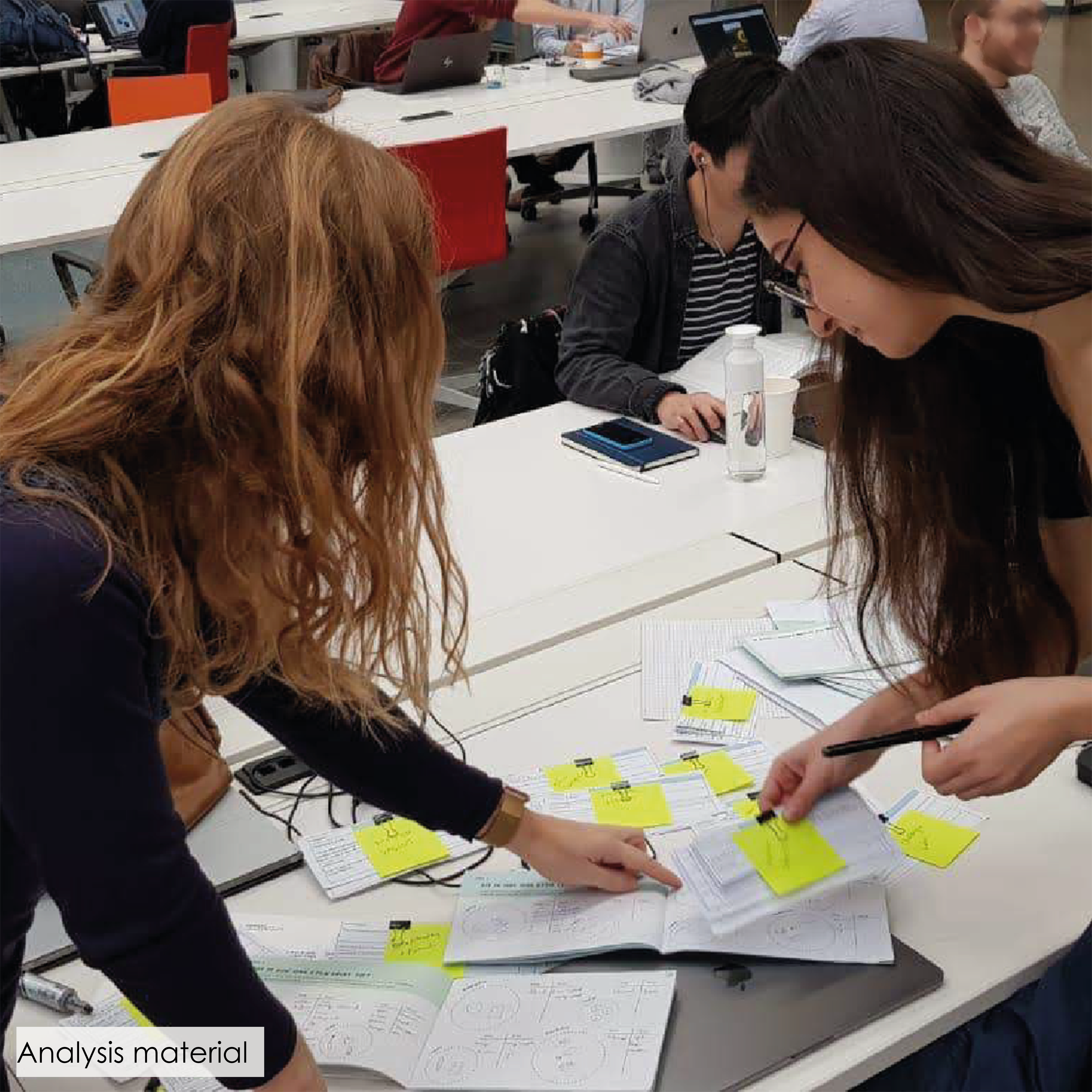
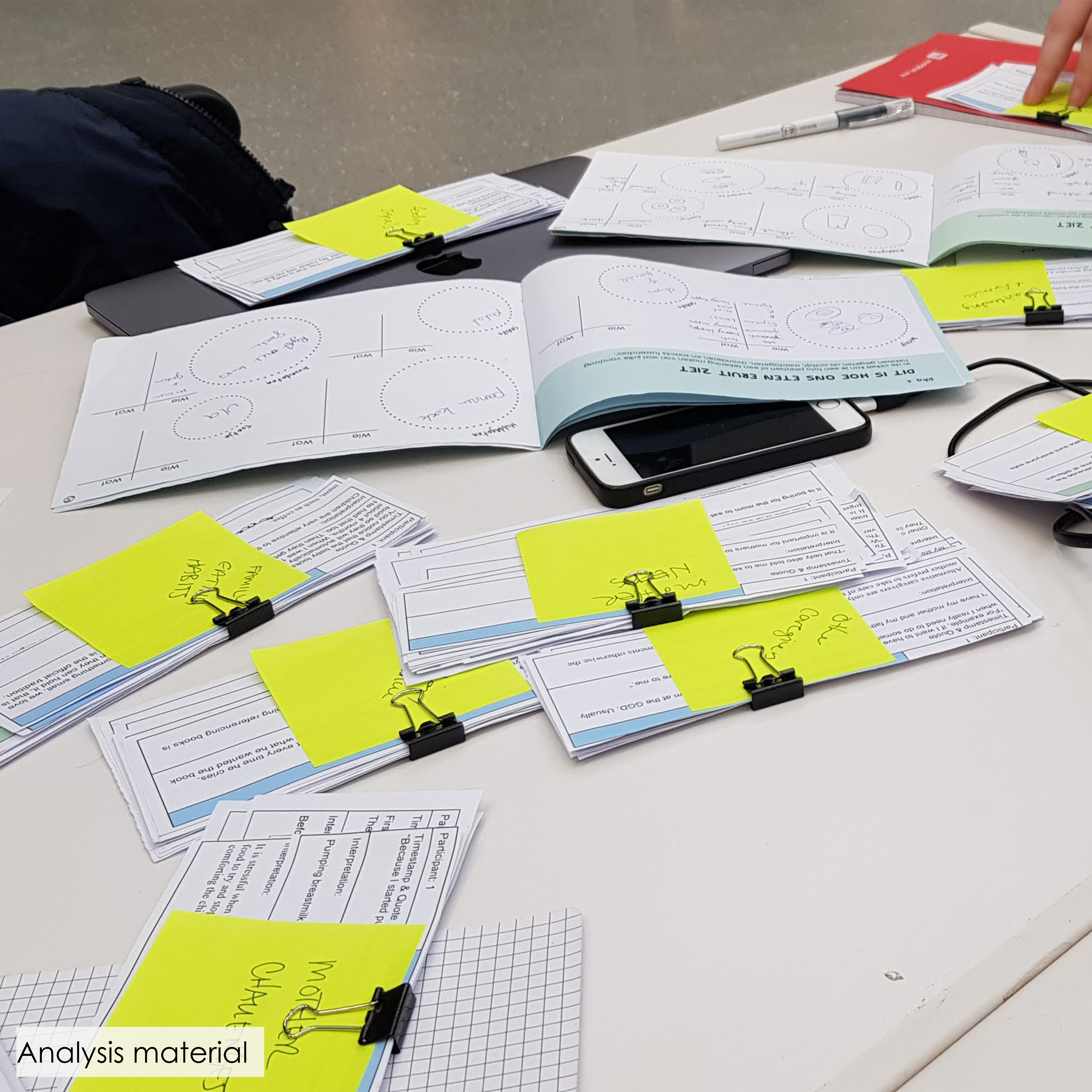
This project really was an eye opener for me on the value of using methods like contextmapping. At the start of the project we made an assumption map of what we thought to know about this target group and topic. At the end of the project we looked back at the innitial assumption map and found out that we were wrong about a lot of things since we did not know the target group at the start of the project. During the process we really got to know them and understand their values and needs.
Contextmapping Skills
2. Baby feeding habits
Graduation Project
3. Child Participation Toolkit
Developing a tested vision for the design of a child participation toolkit to be used independently by the Pedagogical Employees in order to discover the latent knowledge of the children.
Client: SWKGroep
Collaboration: Induvidual project
Keywords: Interviewing, Contextmapping, analysis, creative facilitation, prototyping, user testing, toolkit
Cultural Probes
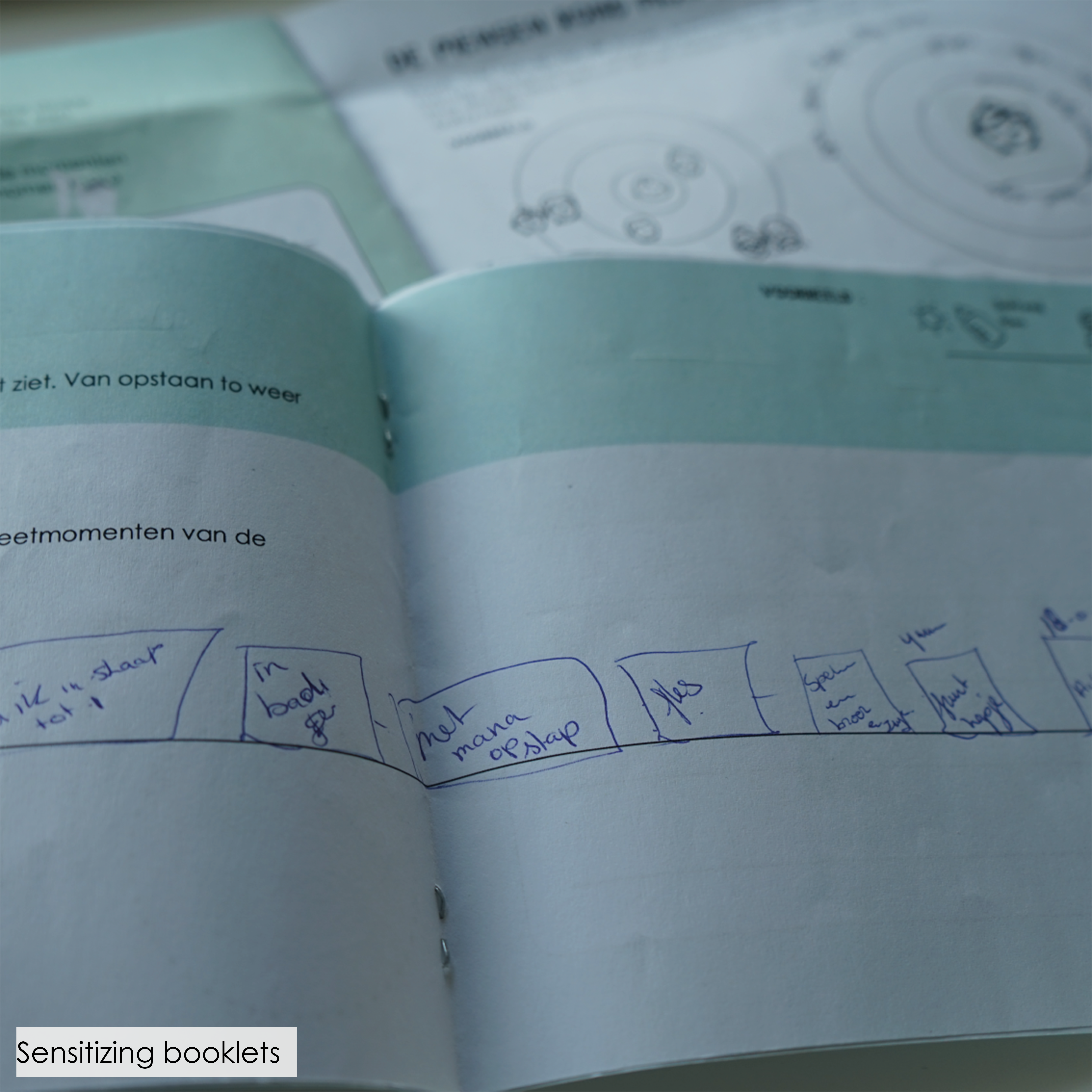
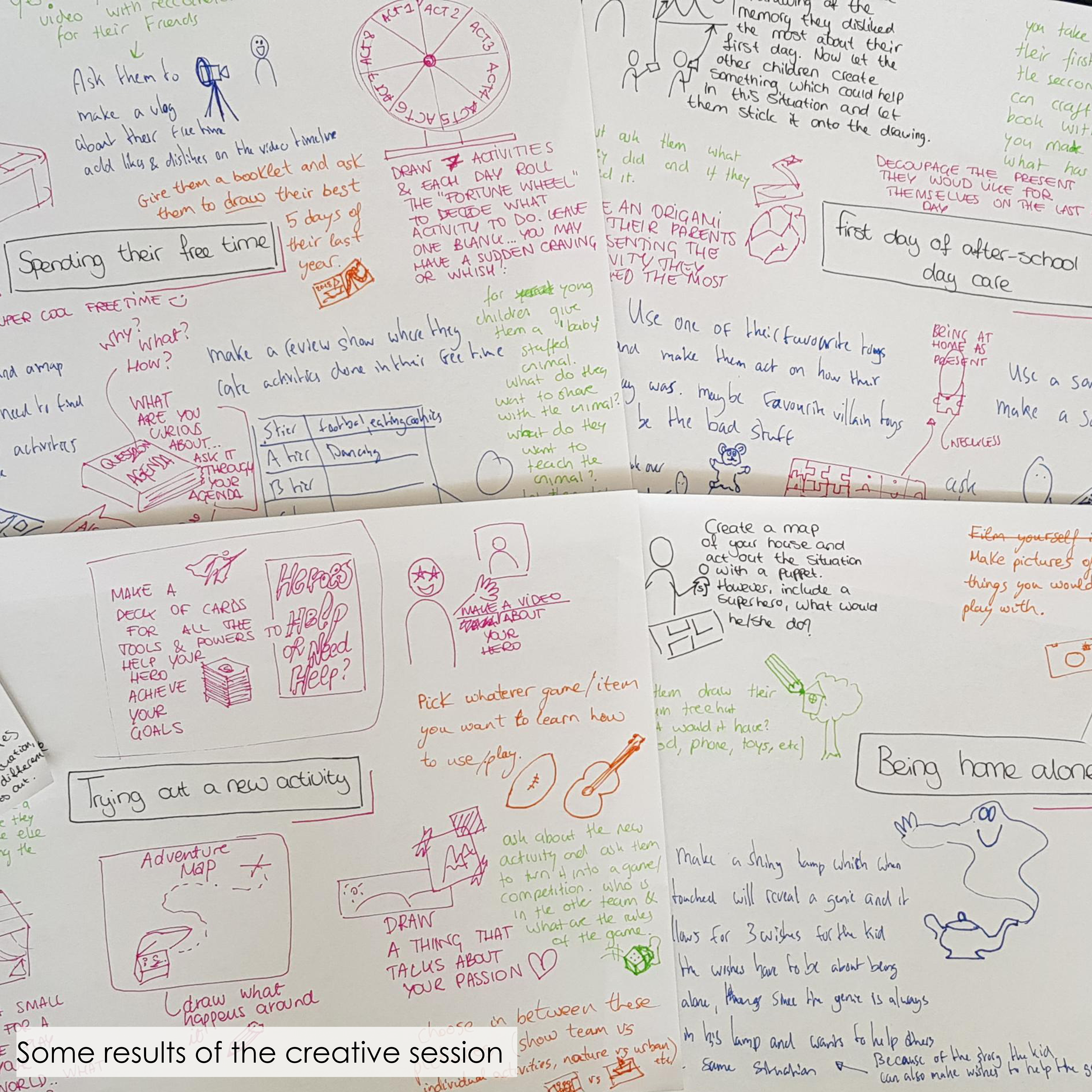
Literature research showed that a good approach to reach latent knowledge is by using cultural probes. By letting the children think back about an experience and reflect on this experience it will be easier to find out their values and needs. Therefore the toolkit should consist of tools which are based on the theory of cultural probes.
Multiple Intelligences
Another thing found during literature research is that different children have different ways how they can express themselves. E.g. some are better at drawing whereas others are better at expressing themselves through acting. It is important that the toolkit has a good variety in the skills that are used in order to let all children be able to express their thoughts.
Playful
Interviews showed that a very important factor is that the BSO is free time. The children should want to participate voluntarily, therefor it is important to implement a playful aspect to the exercises.
Explanation Cards
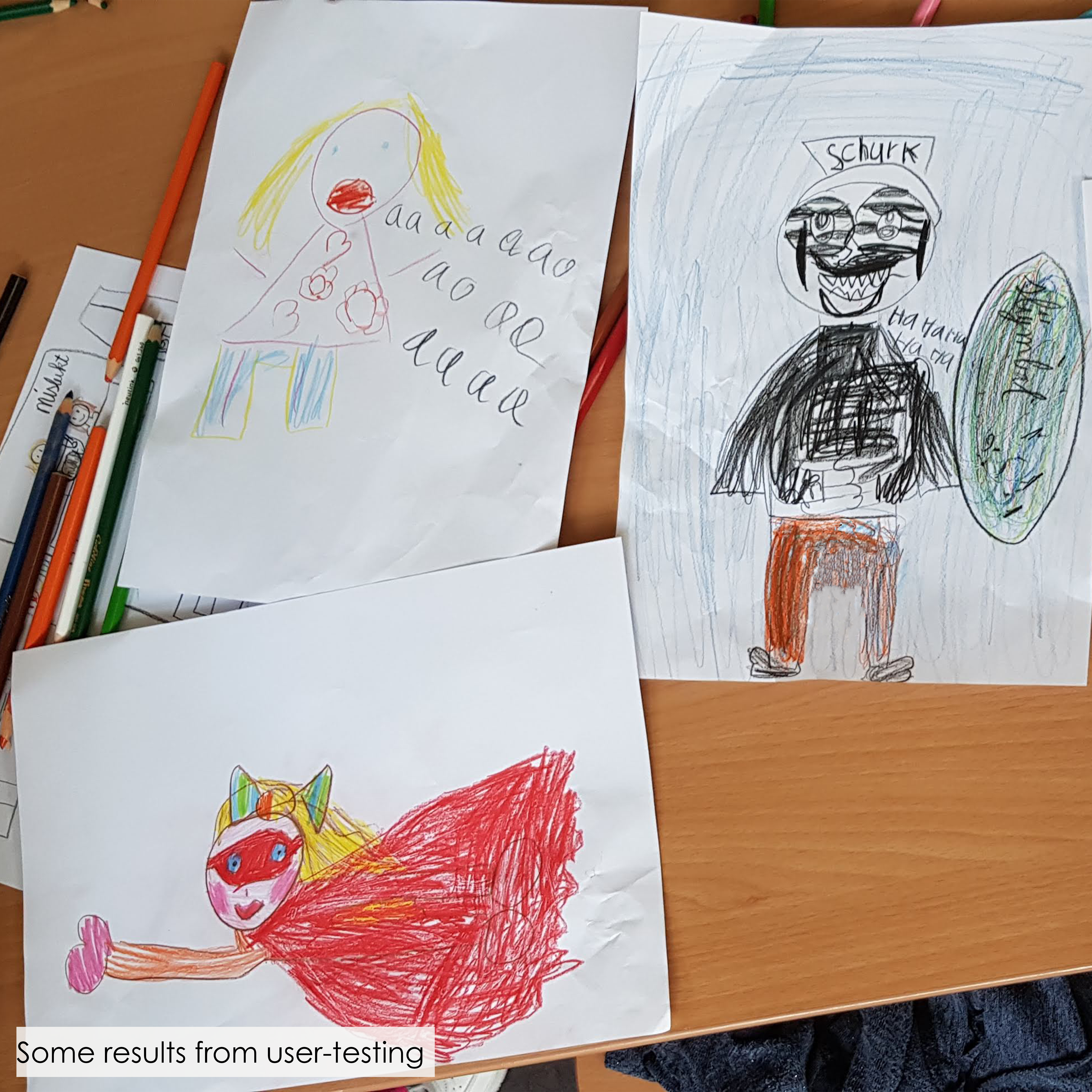
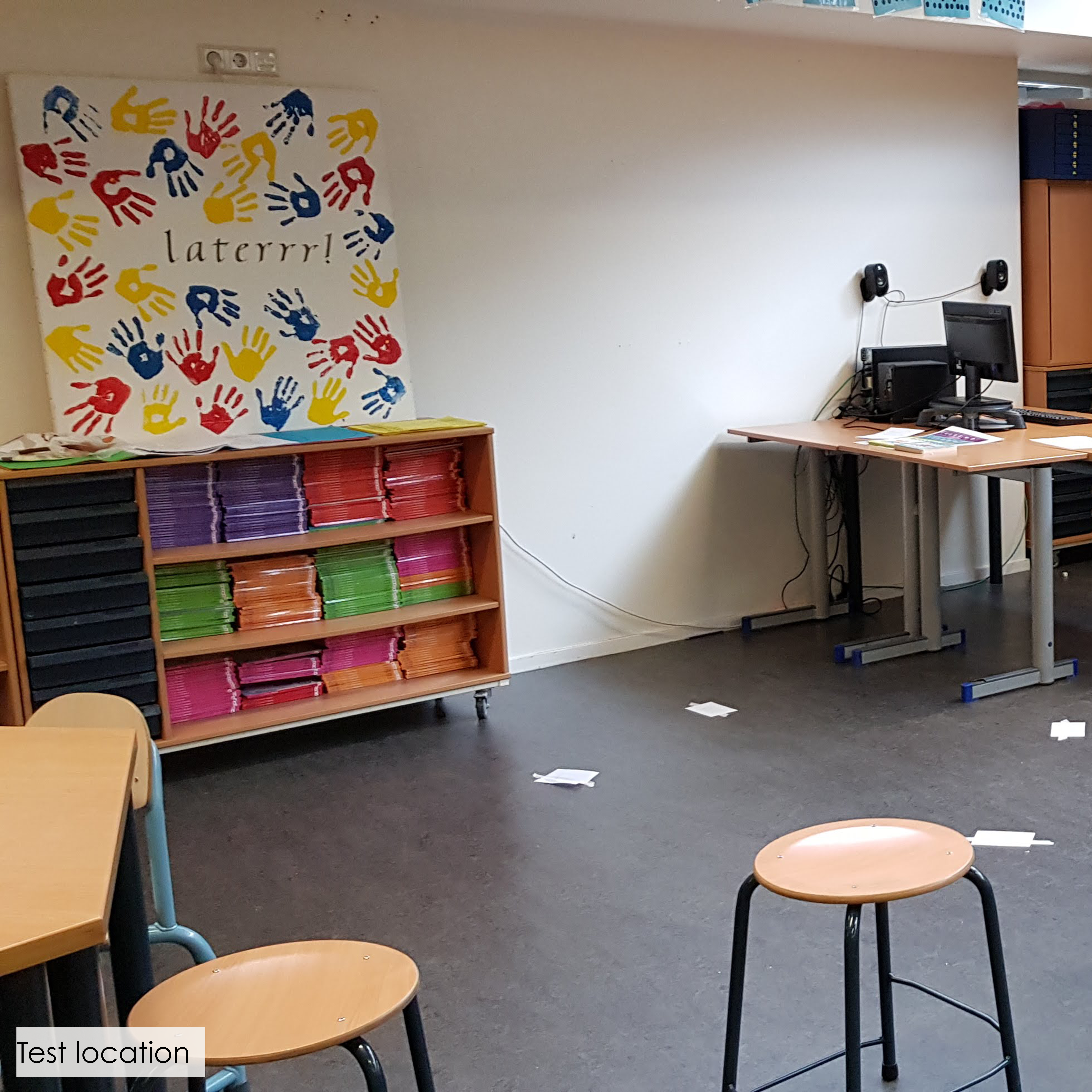
Since the Pedagogical Employees are not trained in using cultural probes an analyzing results it is important to have clear explanation cards. By trying out different set ups through prototype testing I could define important aspects of these explanation cards.
For me this project was really interesting since it involved a lot of research, analysis and prototyping. These are my prefered roles within a project.
Also I found out that my preference really goes to working within in a team instead of individual. I really see the added value of having conversations/discussions with others, therefore I tried to implement a lot of brainstorm sessions with fellow students during this project.
Video Player
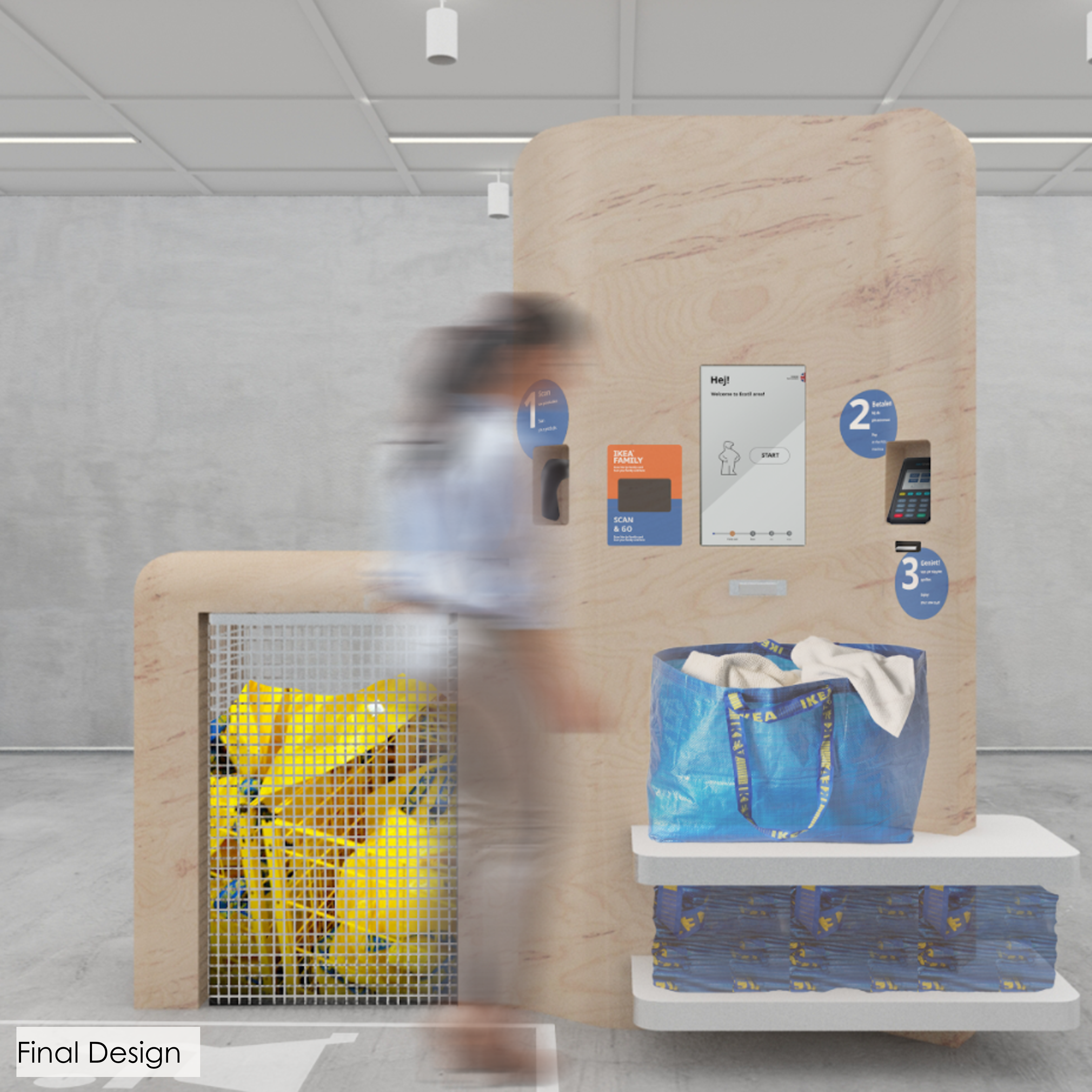
Improving the IKEA shopping experience by making the self-scan checkout more part of this experience and more coherent to the overall IKEA style.
Client: IKEA
Collaboration: Group of 5
My role: Interviews, observations, analysis, prototyping physical part, user testing both physical and digital part
Keywords: Interviewing, observations, analysis, prototyping, user testing, interface design, spatial design
Simple
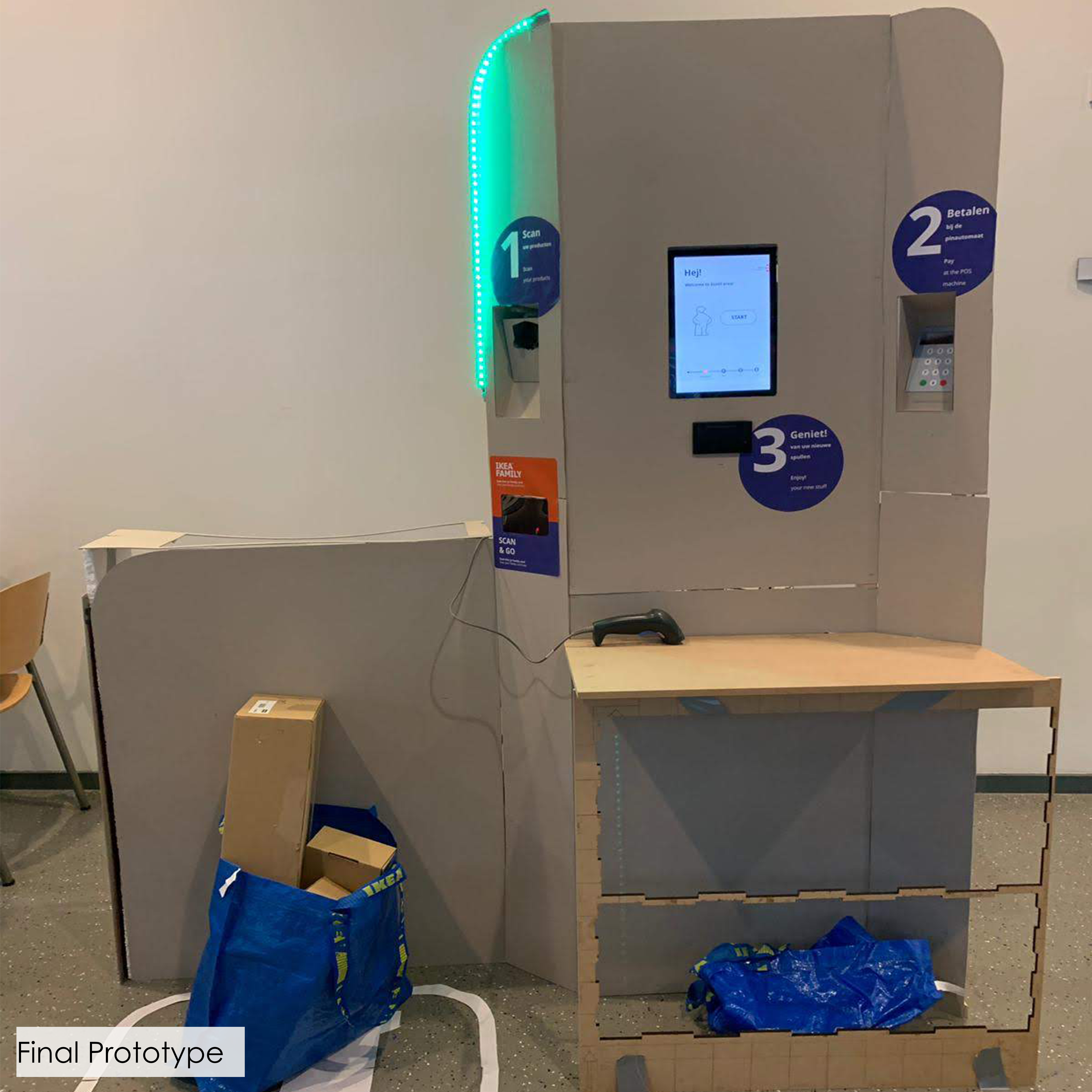
Interviews and observations about the current self-scan check out showed us that it was too chaotic. There were too many steps and even options like paying with cash which were not even possible. The redesign is simple and has no information that doesn’t add value.
Intuitive
Our research showed us that the current design was not intuitive enough. People did not always know where they were in the process. The redesign consists of 3 clear steps which are represented in both the physical as well as digital design.
IKEA family card
We saw that a lot of people had trouble adding the family card. They wanted to do this at the wrong point in the process or they forgot it completely. The redesign has its own family card scanner, this scanner reminds the customers to scan their card. Another improvement is that the card can be scanned at any time during the process.
Personal
To make the complete experience more personal we choose to add the little guy onto the screen (known from the IKEA manuals). They could press the guy any time in the process to ask for help. Also the guy would get a personal outfit when the family card is scanned, this to give extra visual feedback that the card was scanned correctly.
What I really liked about this specific project was all different aspects which were involved in the design. We designed not only the physical self-scan but also the interface and the area in which the self-scan would be placed.
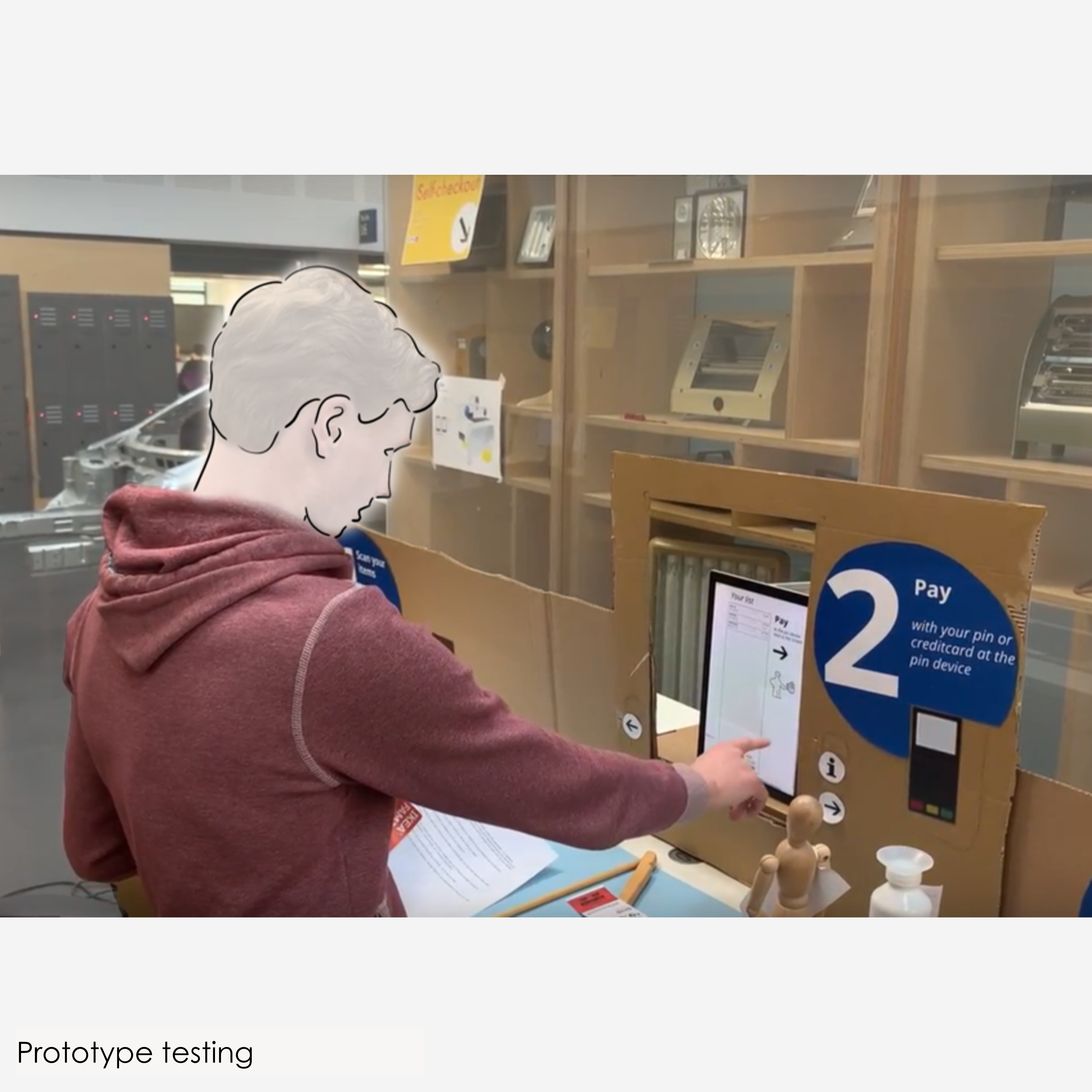
Also I really enjoyed the user testing since we got a lot of valuable insights from relatively simple prototypes.
User experience assessment in design
4. IKEA Check-Out
Bluedot
design competition
5. ColorNotes
With this project I participated in the BlueDot design contest 2019/2020. The theme of this years contest was “Calm and Chaos”.
‘Nowadays, we live in a fast moving world in which people are constantly rushing around. Take a step back from the chaos, how do you take a break from the buisy world?’
Client: BlueDot
Collaboration: Individual project
Keywords: Interviewing, prototyping, user testing
Relaxation
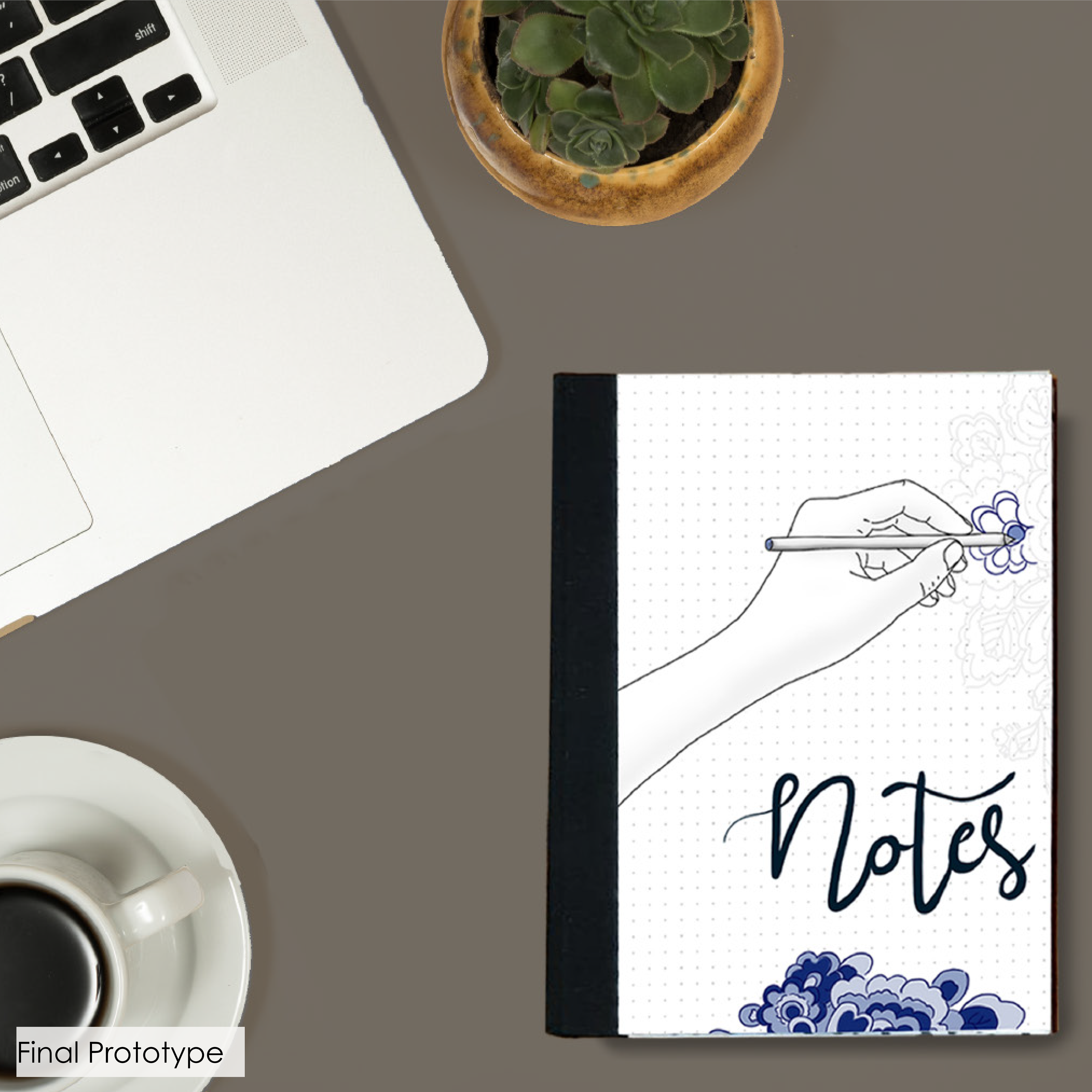
Literature research showed that drawing can actually have a relaxing effect on people during stresfull times. Therefore I choose to combine drawing with a notebook. In this way the user can easily do some drawing during for example work or study.
Suggesting lines
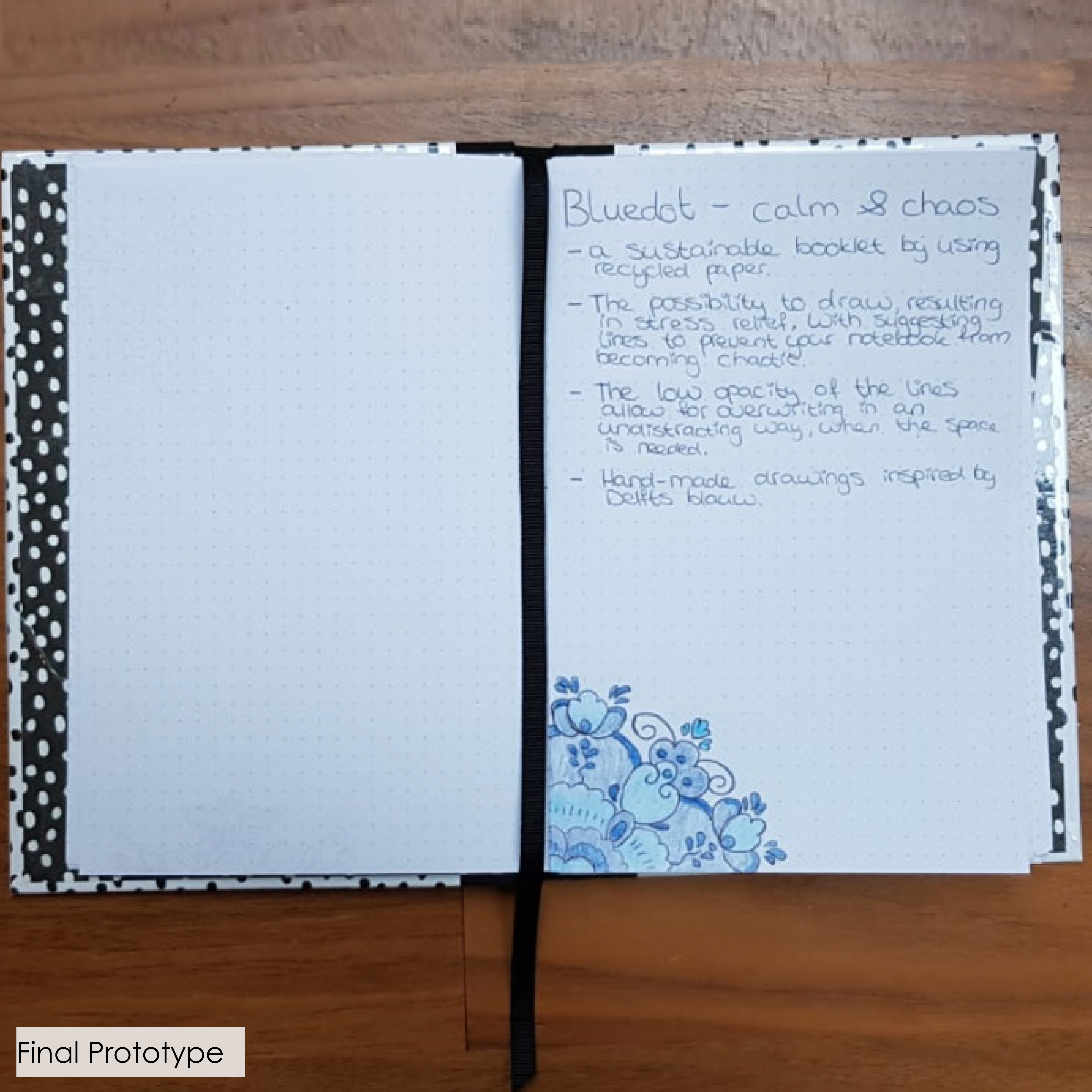
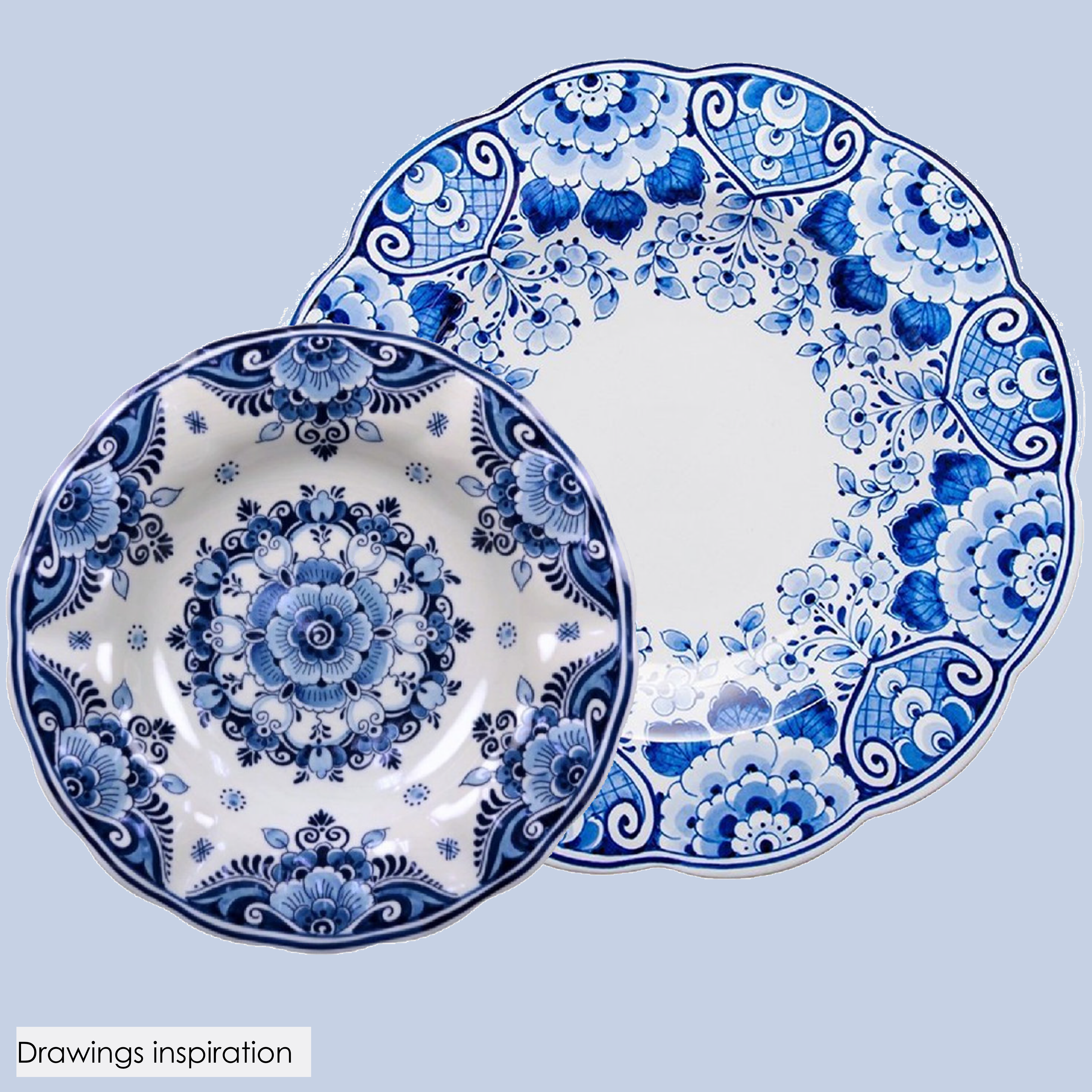
Interviews showed me that drawings in a notebook are experienced as chaotic. Therefore the drawing are pre made like a coloring plate. The design is inspired by the Delfts Blauw drawings. Also there are three shades of blue drawing pencils added to the notebook. In this way the drawings will always look neat and will not make your page chaotic.
Opacity
Of course you might sometimes need the entire page for your notes and you don’t want to have a drawing on that page. Therefore the lines of the drawing are made in low opacity. In this way the user can choose to just write over the lines instead of drawing them. In order to let the lines not be distracting you from the text I did user research with different opacities.
The thing I liked about this project is that it shows a solution does not always have to be complex. The idea is based on two well-known and simple products, however by combining these into one product the desired effect is achieved.
🏆 3d place in the BlueDot design competition.
With our design, we wanted to give “the normal people” a better understanding for heroine addicts, to show how sometimes a really small decision, can have a huge impact on someone’s life.
Collaboration: Group of 4
My role: Prototyping in Arduino, user testing
Keywords: Prototyping, immersive experience, user testing.
Reading
Prototype testing showed us that reading the story had a much bigger impact then watching. By reading, the participants could create a more personalized version of the story inside their head.
Feedback
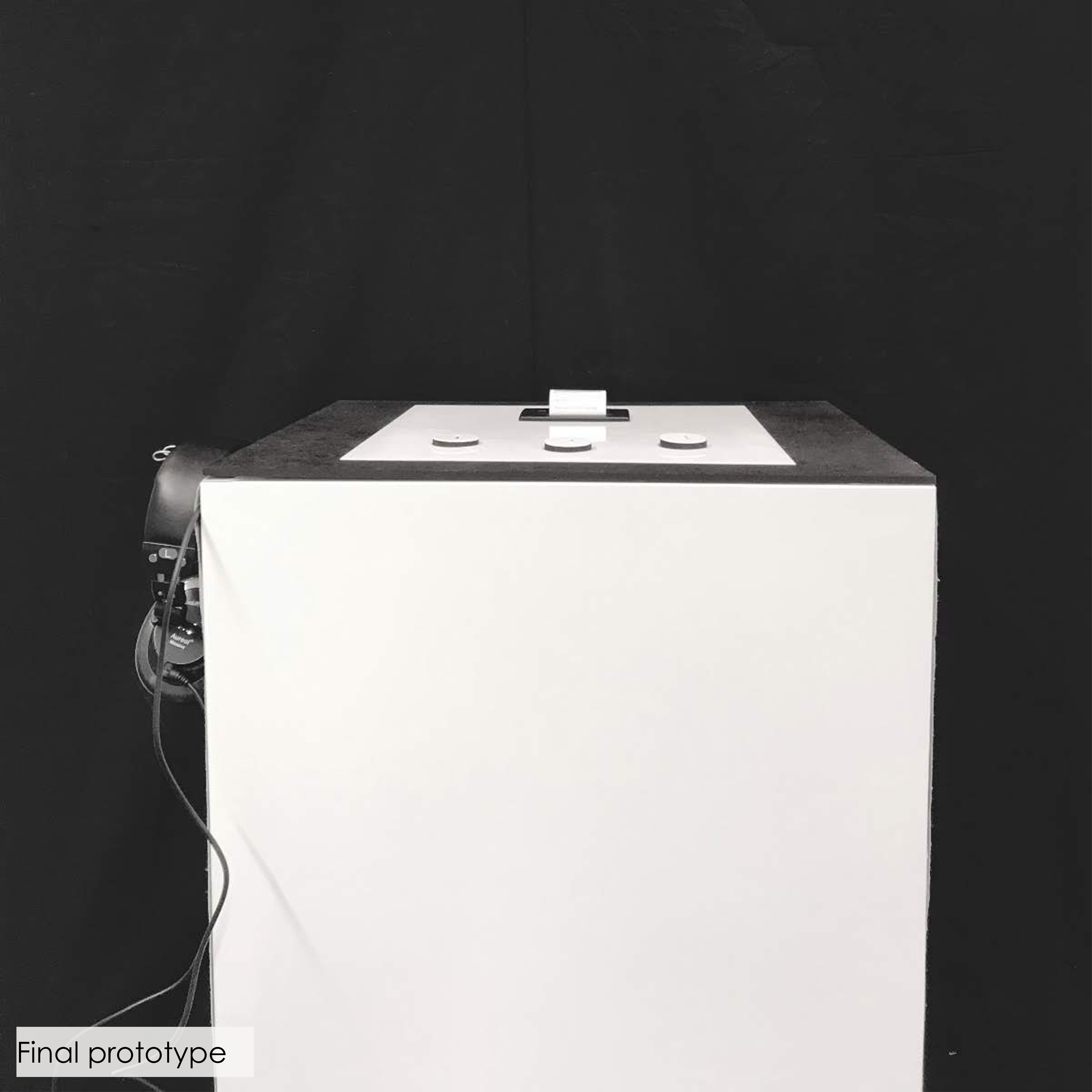
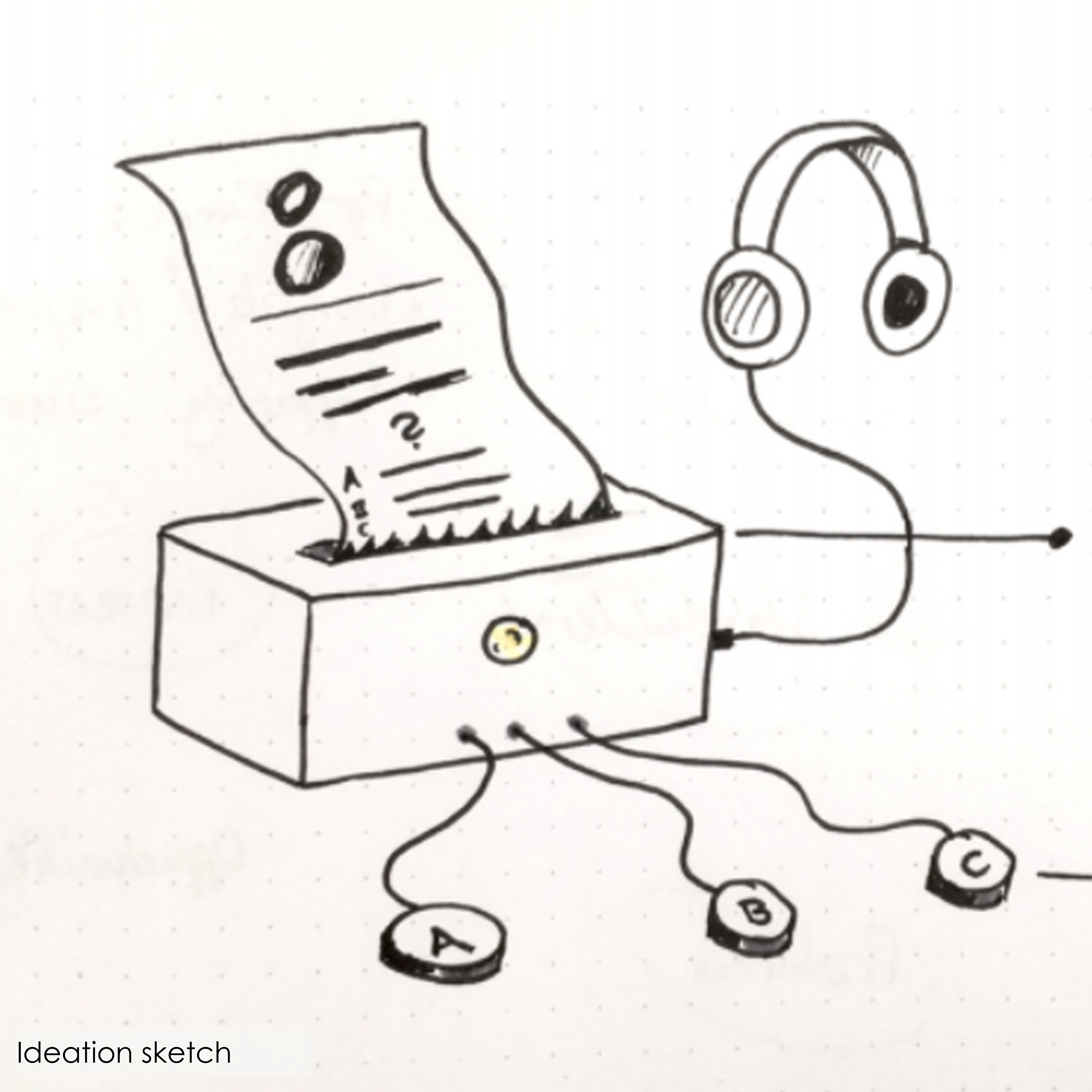
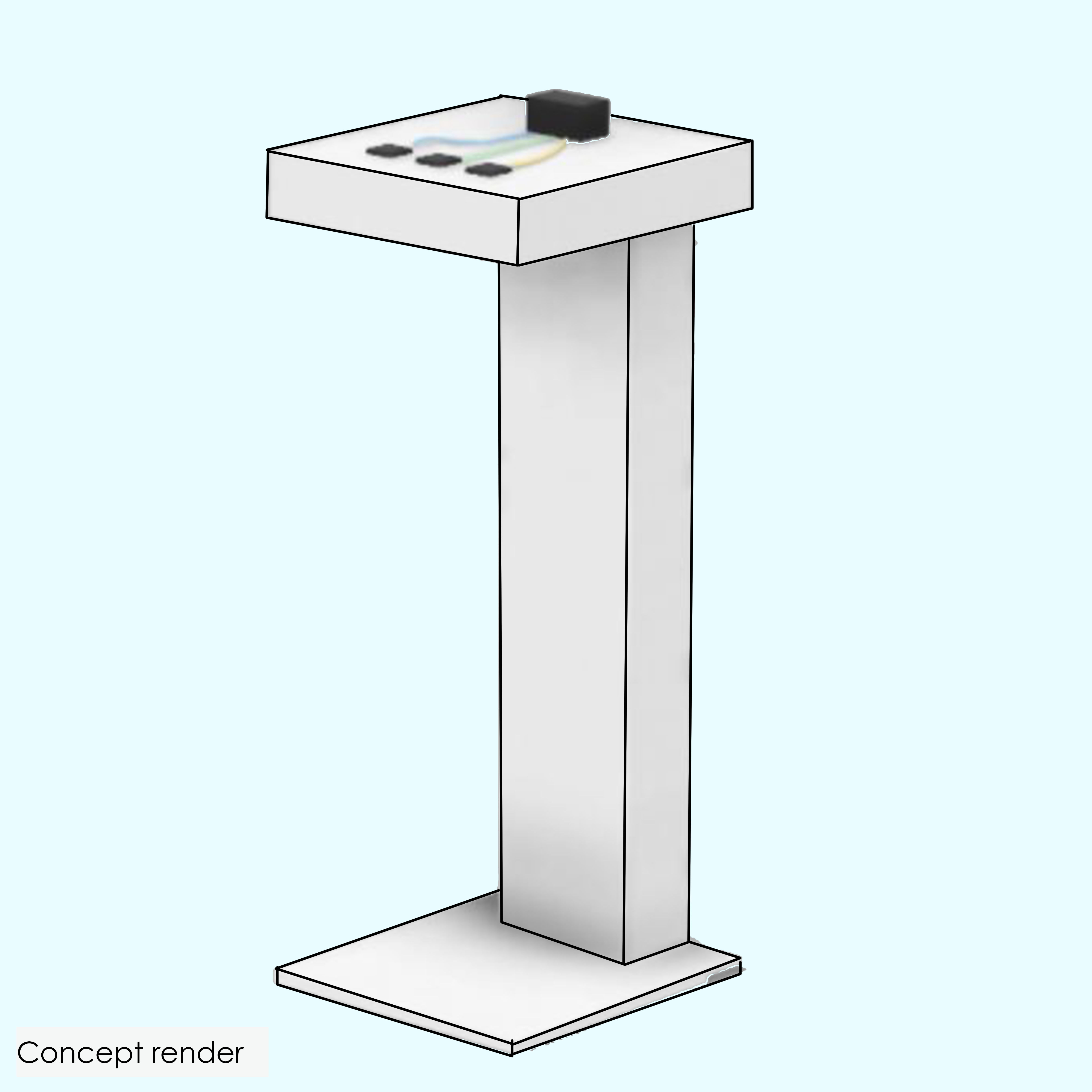
During user testing we found that the story was experienced more immersive when there was a clear visual feedback of their answers. Therefore every time they choose A, B or C there would go a light from the button into the printer. Once the light reached the printer the next part of the story would follow, which was based on this answer.
Empathize
We discovered that it was still quite difficult for the students to empathize with the person inside the story. Therefore we choose the main character in the story to be a student at industrial design, in this way they could empathize better and understand the choices.
Interactive technology design
6. Behind The Story
Exploring Interactions
7. Turn Around
My design goal is to let children, from 8-10 years old, reduce their energy consumption by making them aware of their unconscious energy use.
Collaboration: Individual project
Keywords: Interviews, prototyping, user testing
Curious
From interviews with both children and parents I learned that the children in this age group are very curious. They are unaware about the topic of energy use, but they are excited to learn more about it.
Motivate
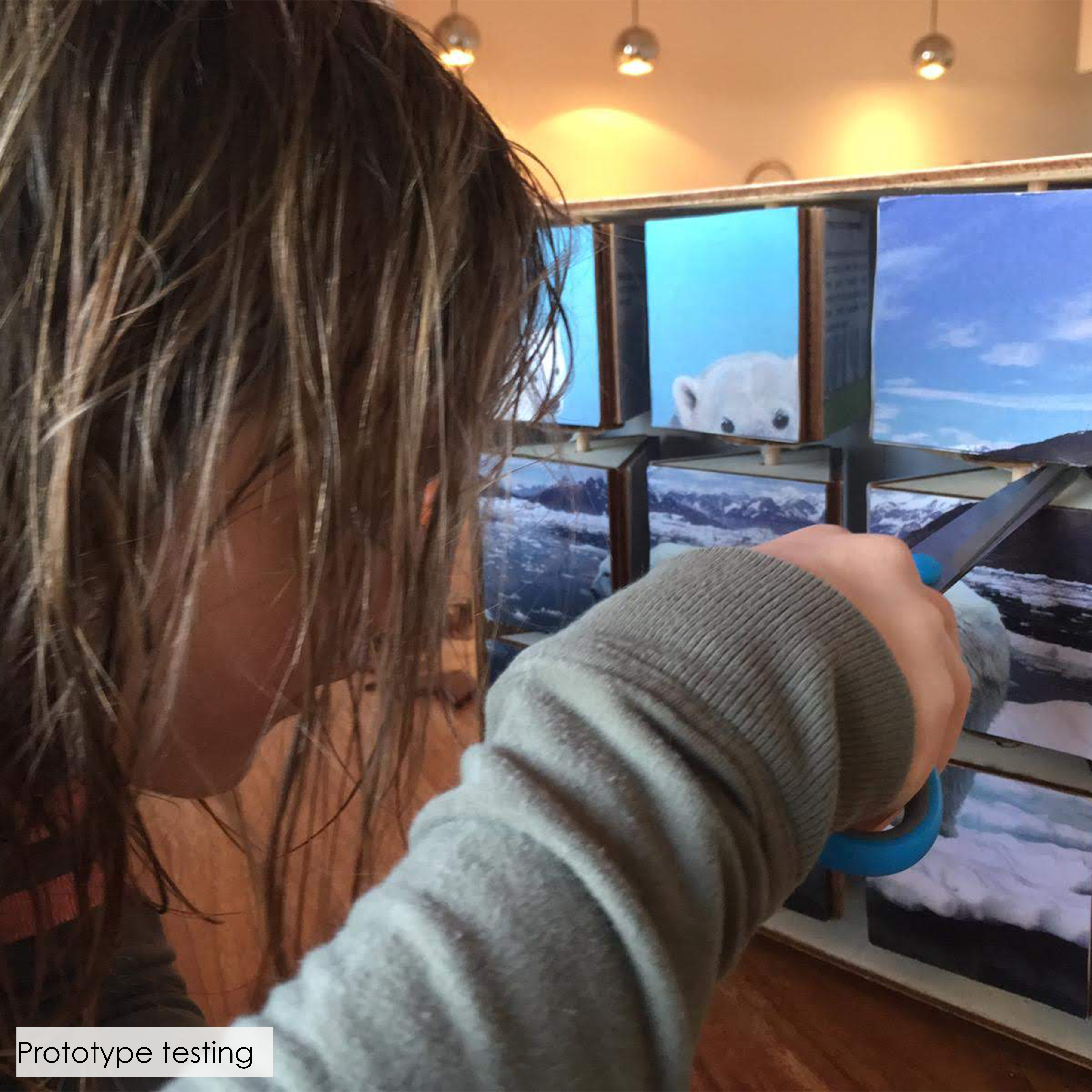
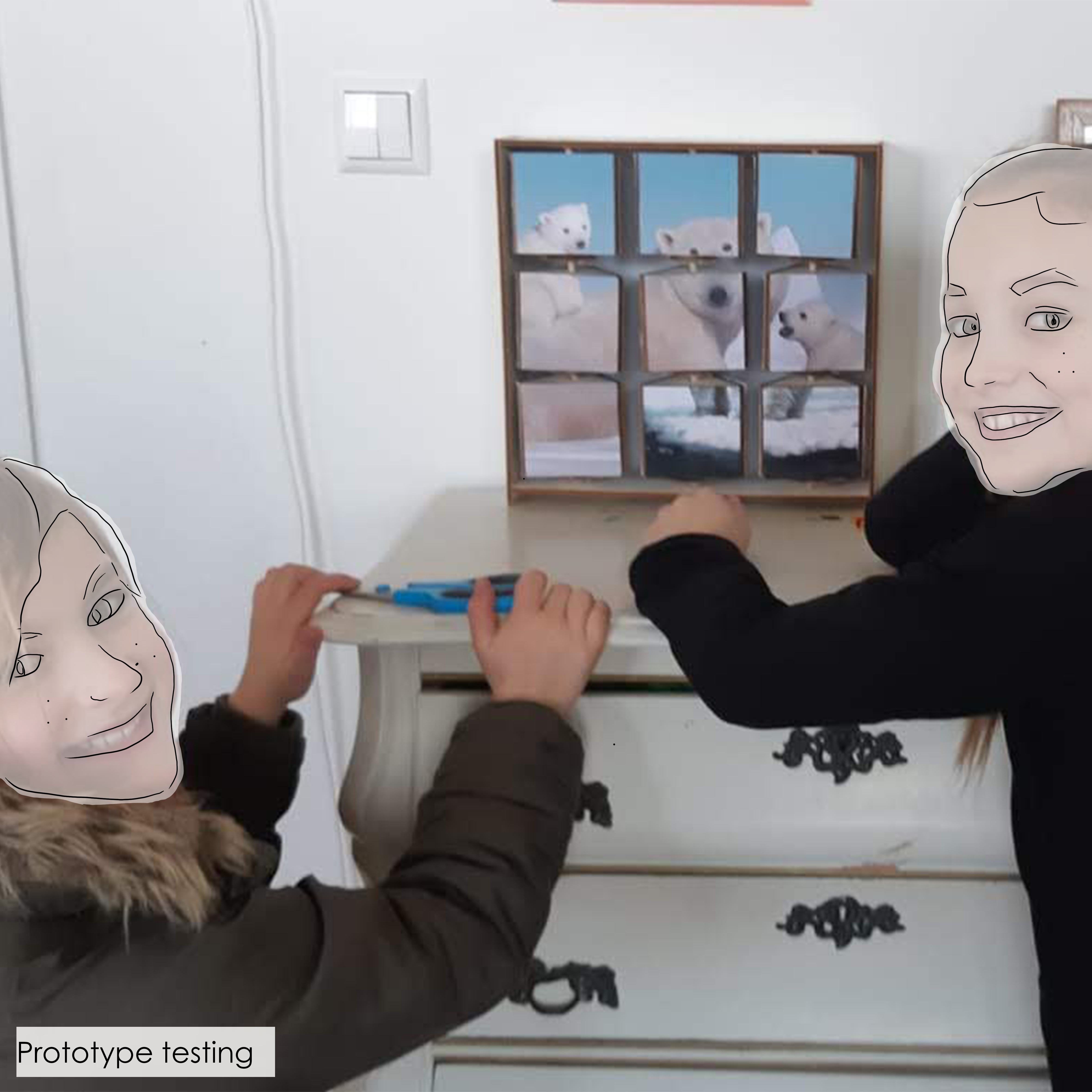
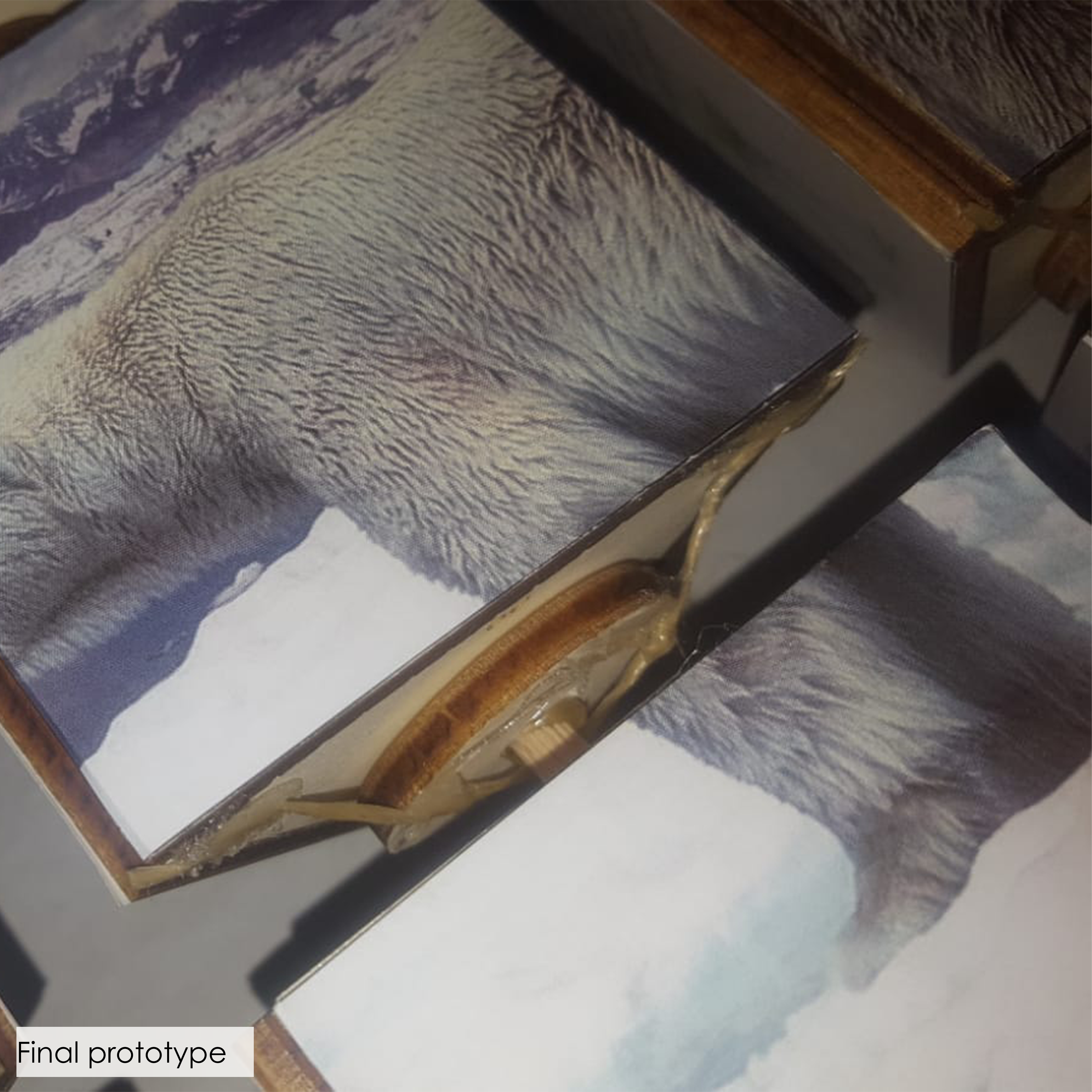
The children needed more motivation to e.g. turn their lights off then just their parents telling them to do so. This product provides a game element where the children can unlock a part of the puzzle and a fact about energy every day they turn off their lights and close the door behind them for the complete day.
Reminding
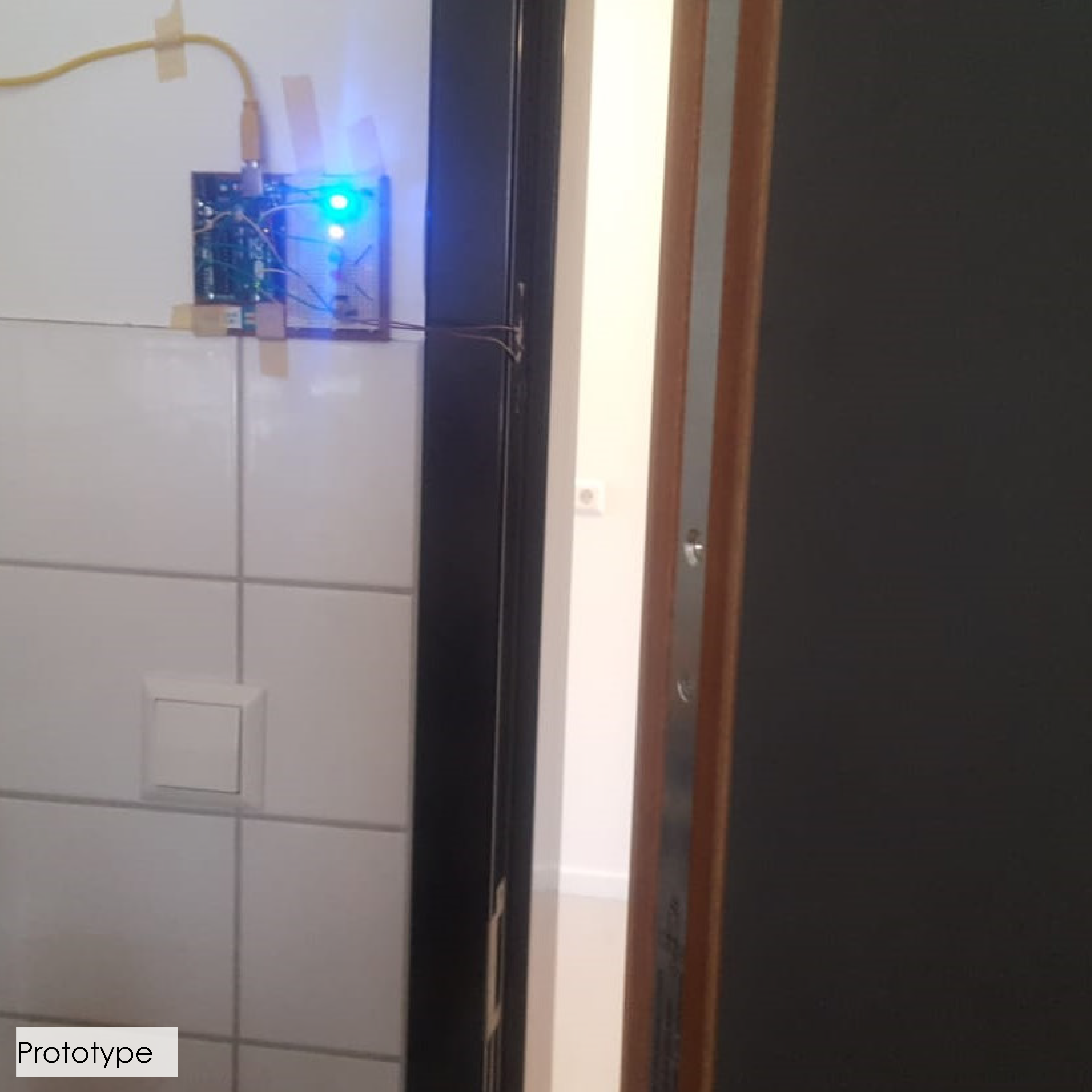
Although being motivated to do these things, user testing showed me that a big part of the problem is simply forgetting the task. A small sensor was put into the door. If the child would leave his/her room a small light would turn on at eye height. This gave a visual reminder to the children to do the tasks.
What I liked about this project was that there was a lot of rapid prototyping providing me quickly with insights about the design. In this way the design could keep on improving in a quick pace.
Nice detail: The girl who tested my final prototype was so excited about the product that she took it with her to school. She showed it to her classmates and the teacher spend the entire morning by talking with the children about saving energy.

